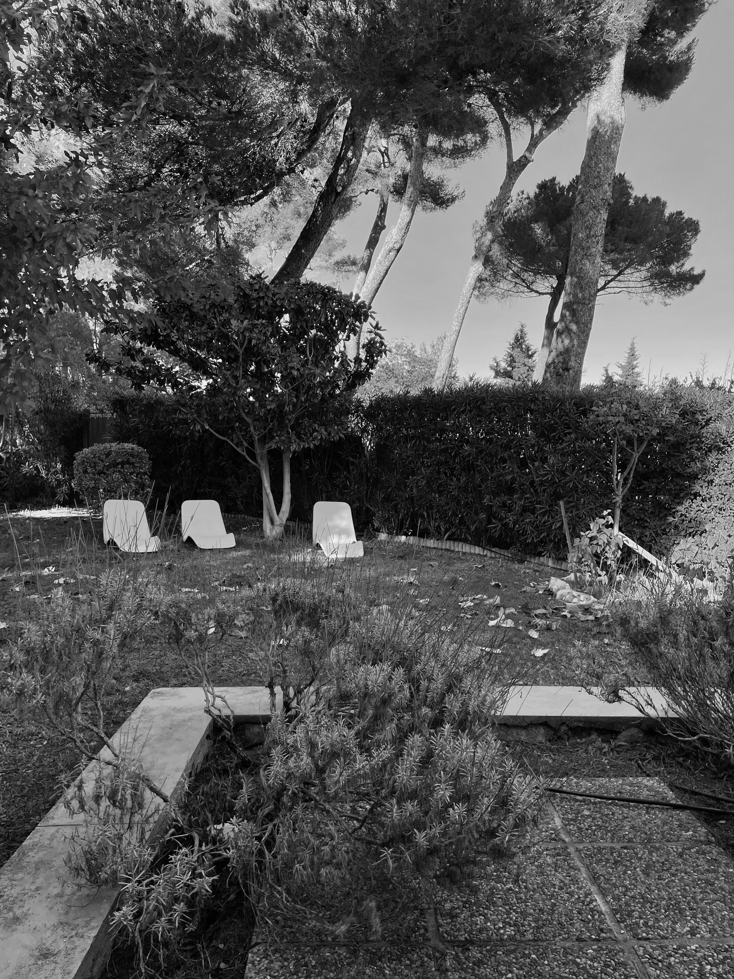
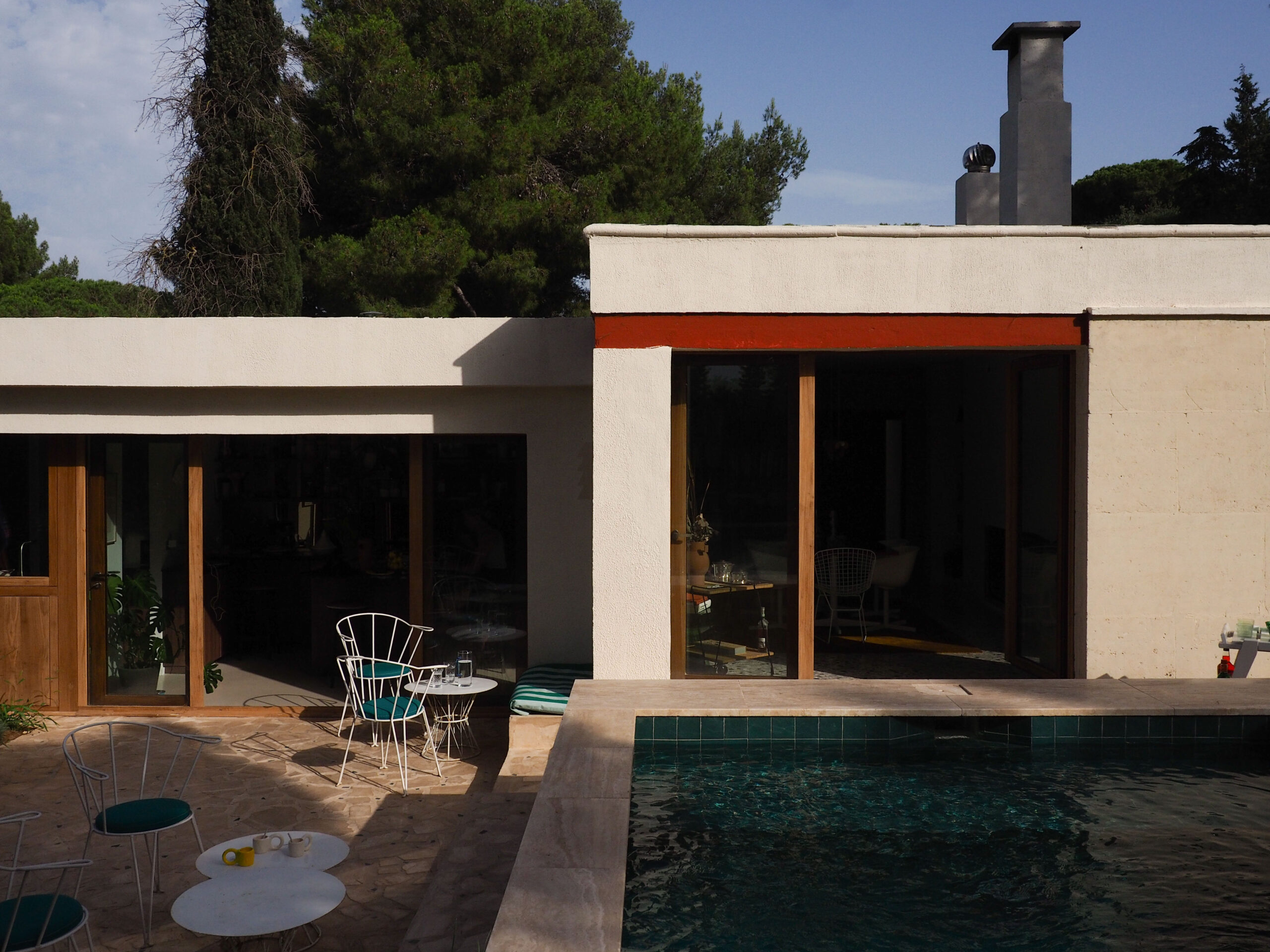
Located in Sceaux, in the inner suburbs of Paris, this architect-designed house has remained intact since 1965, retaining its strong personality and modernist style.

The renovation aimed to preserve its soul while bringing it up to contemporary standards of comfort. A journey orchestrated by our partner architect, Isabelle Heilmann of Épicène.
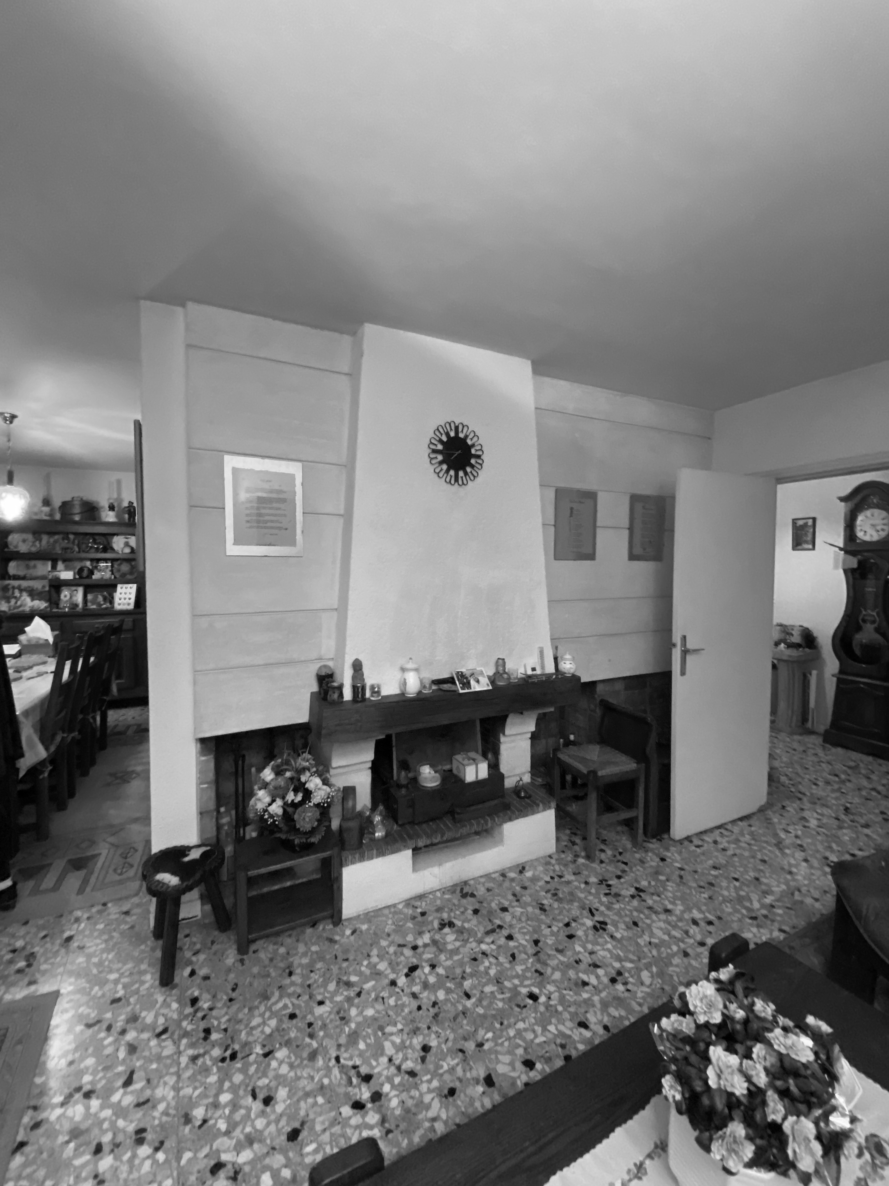
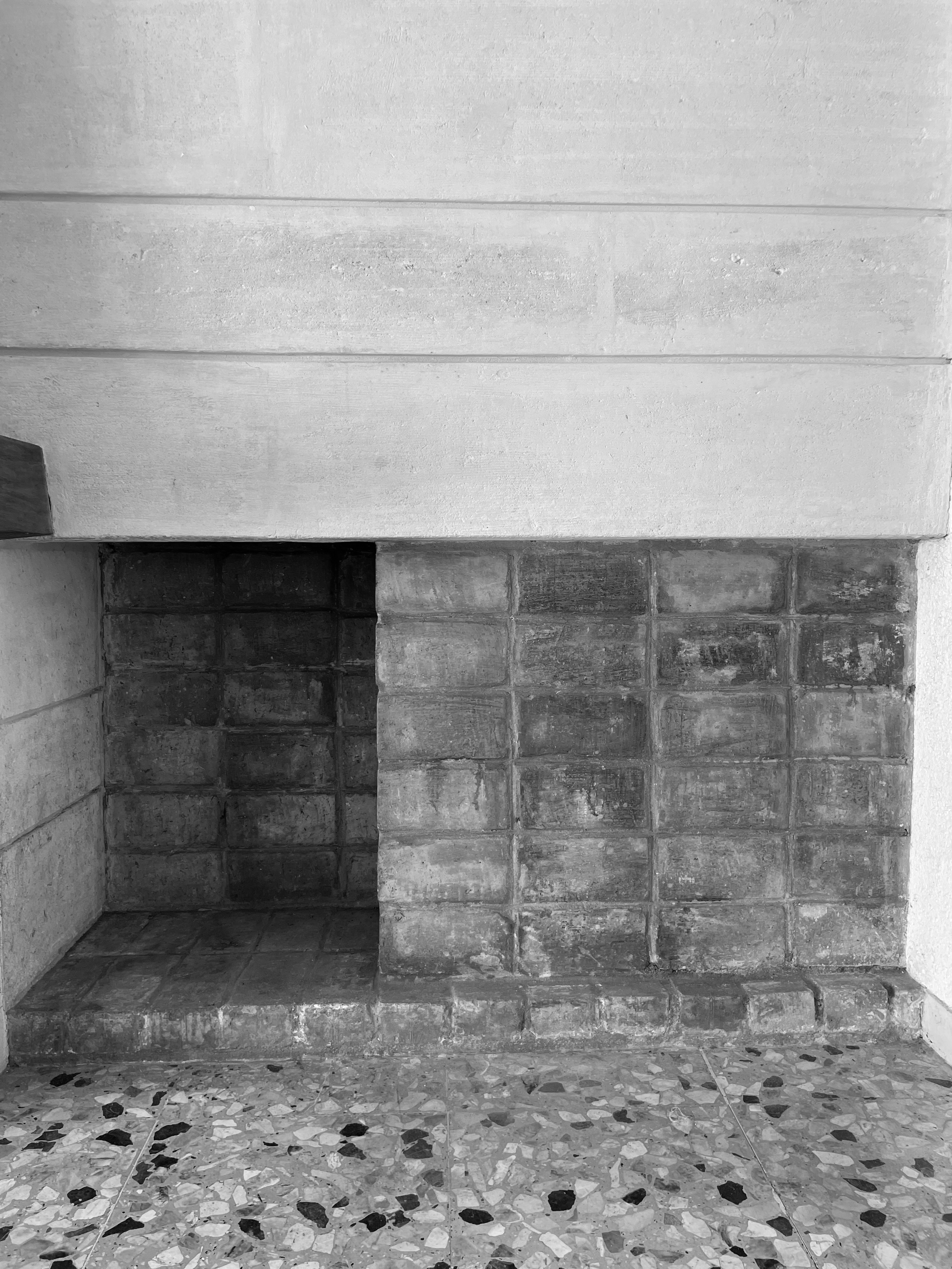
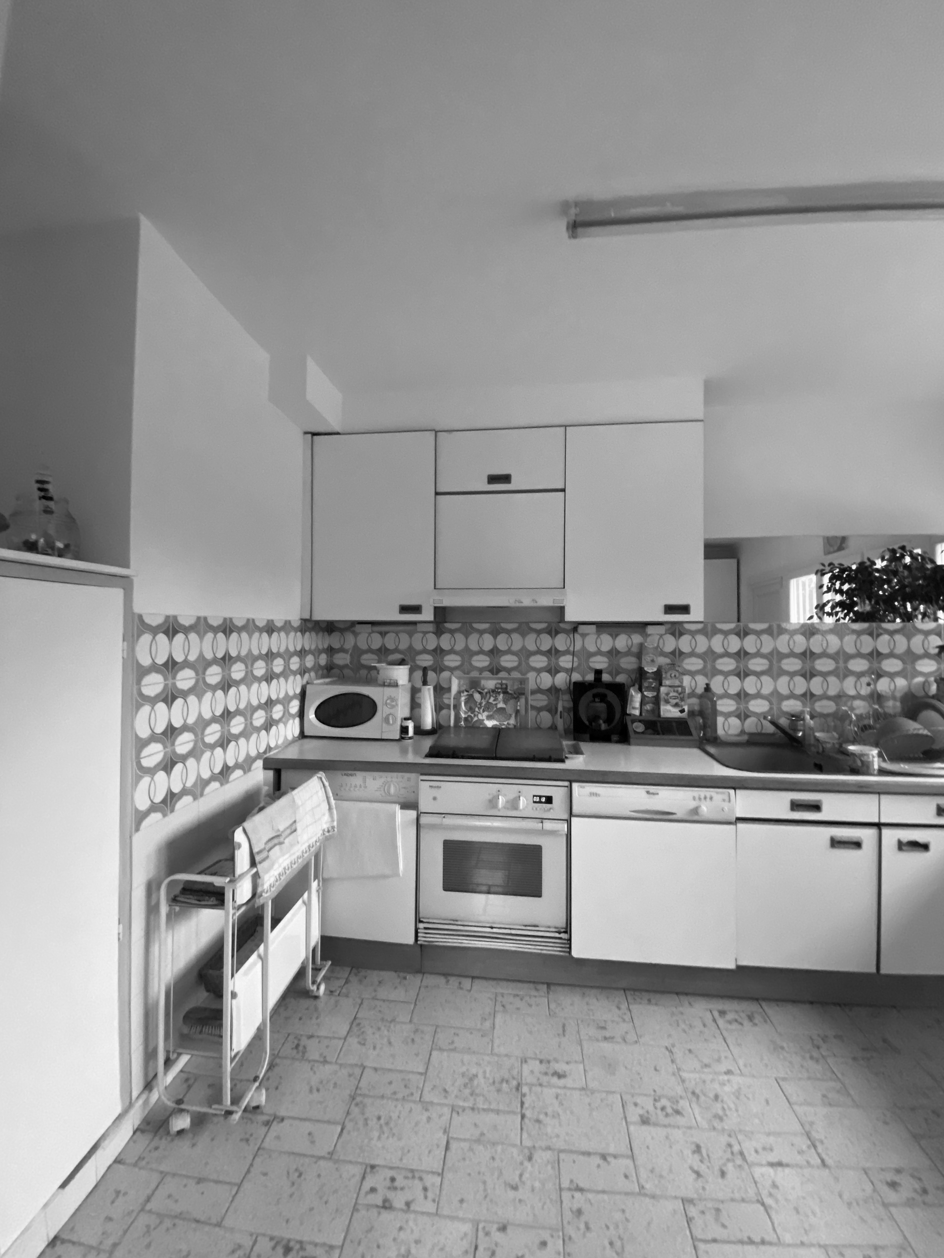
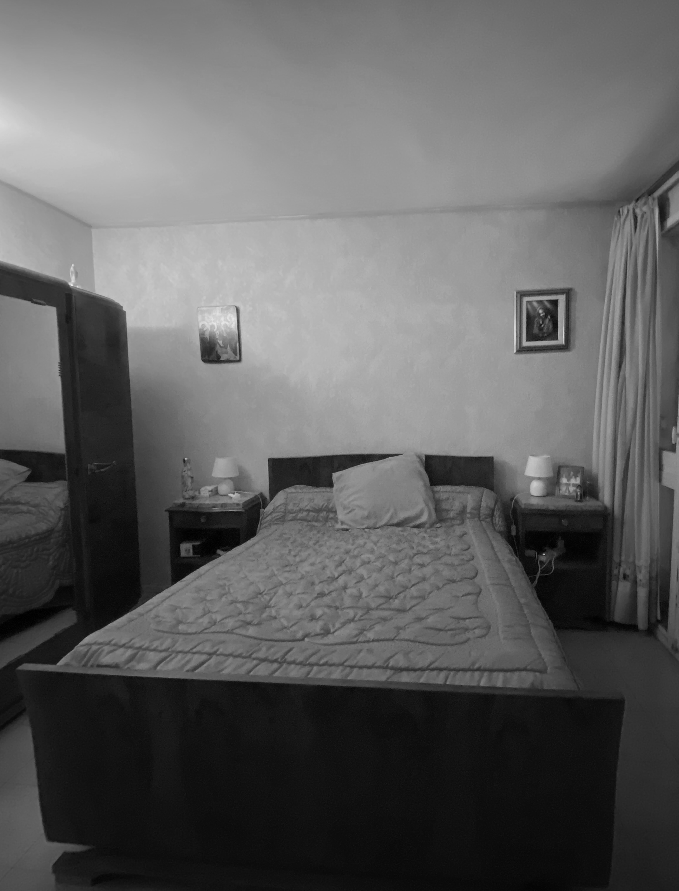
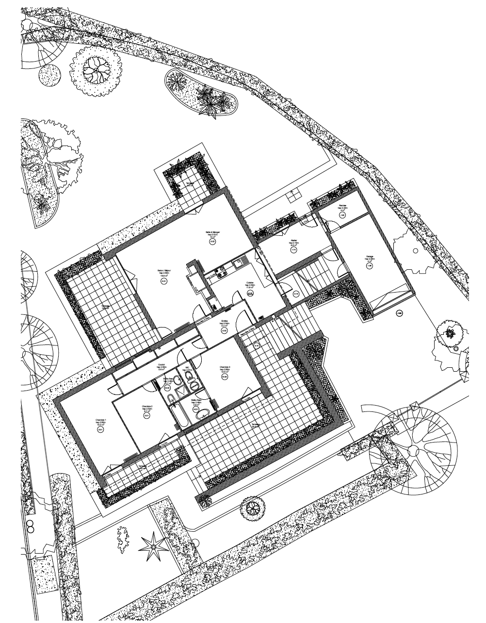
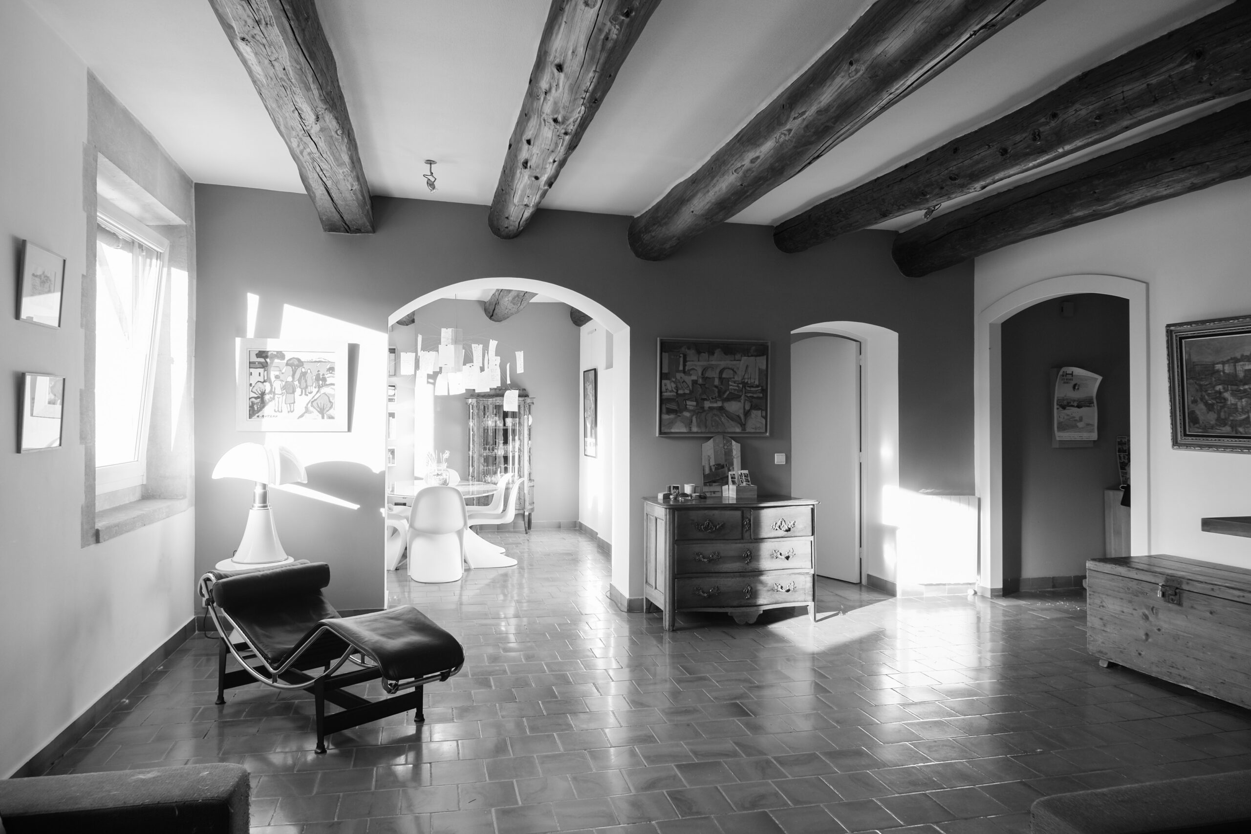
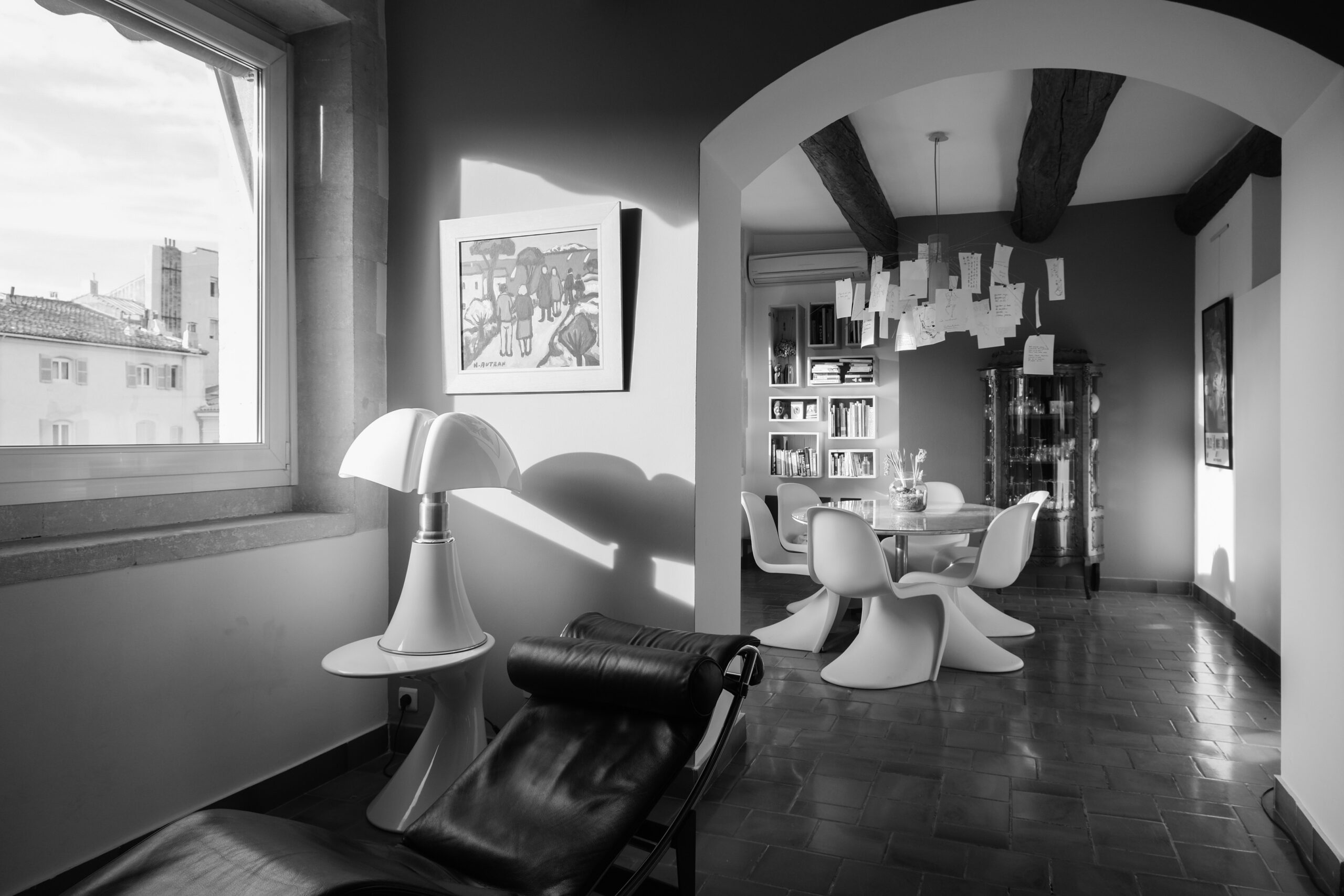
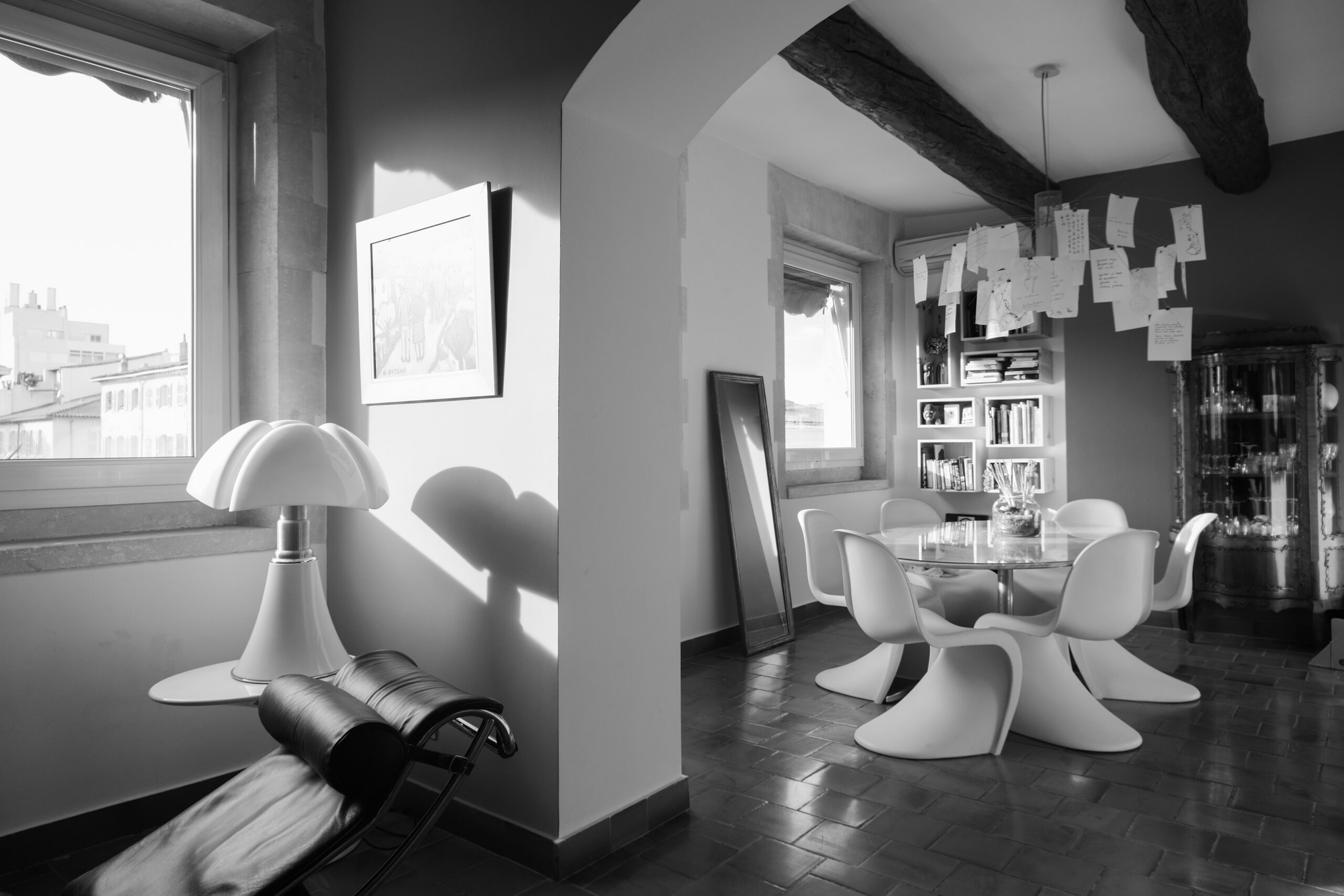
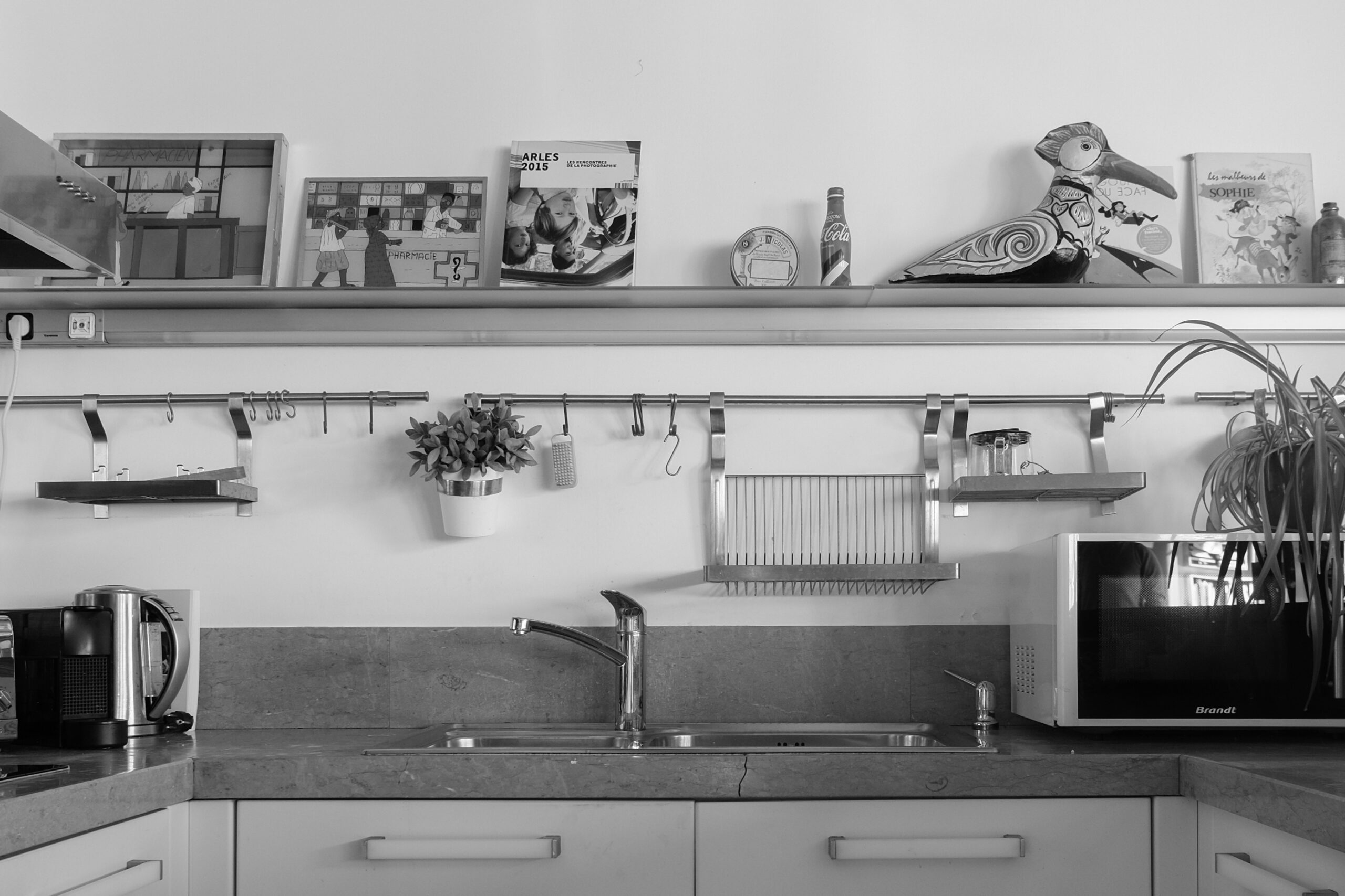
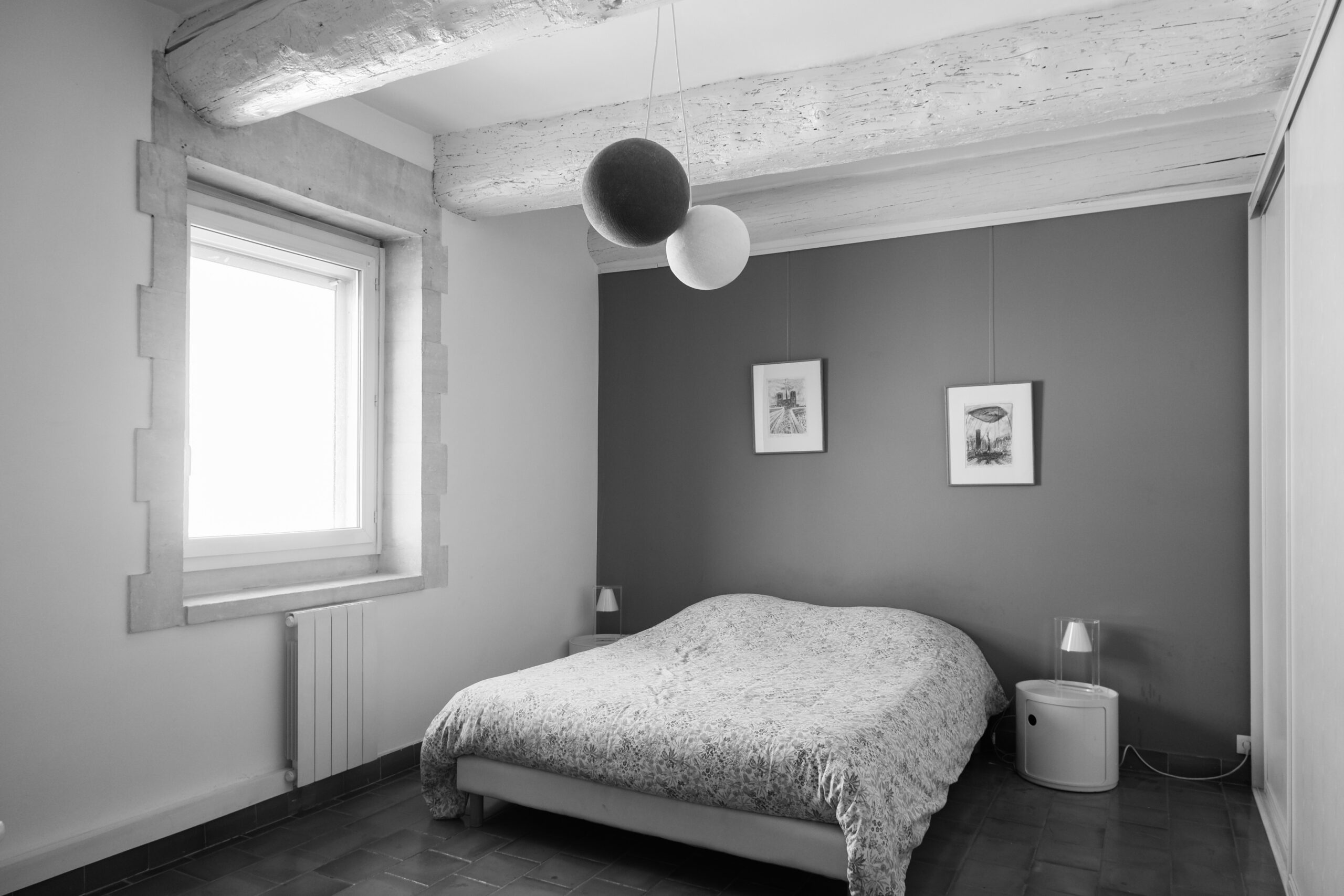
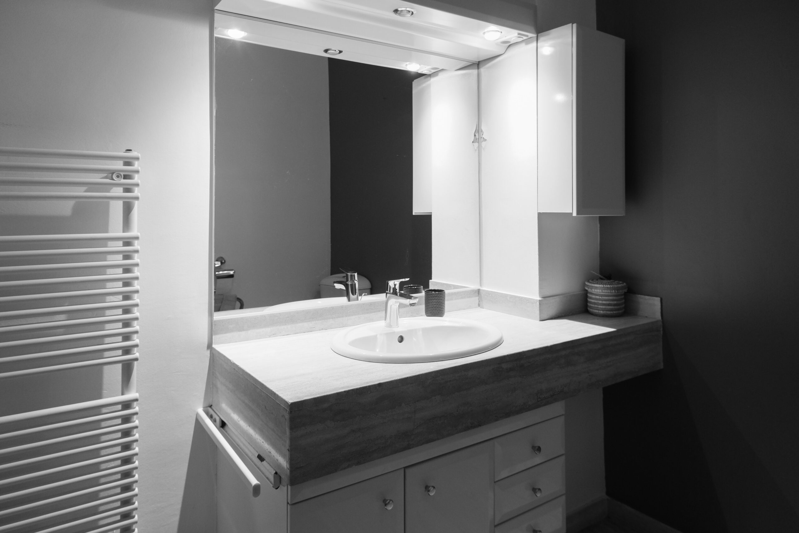
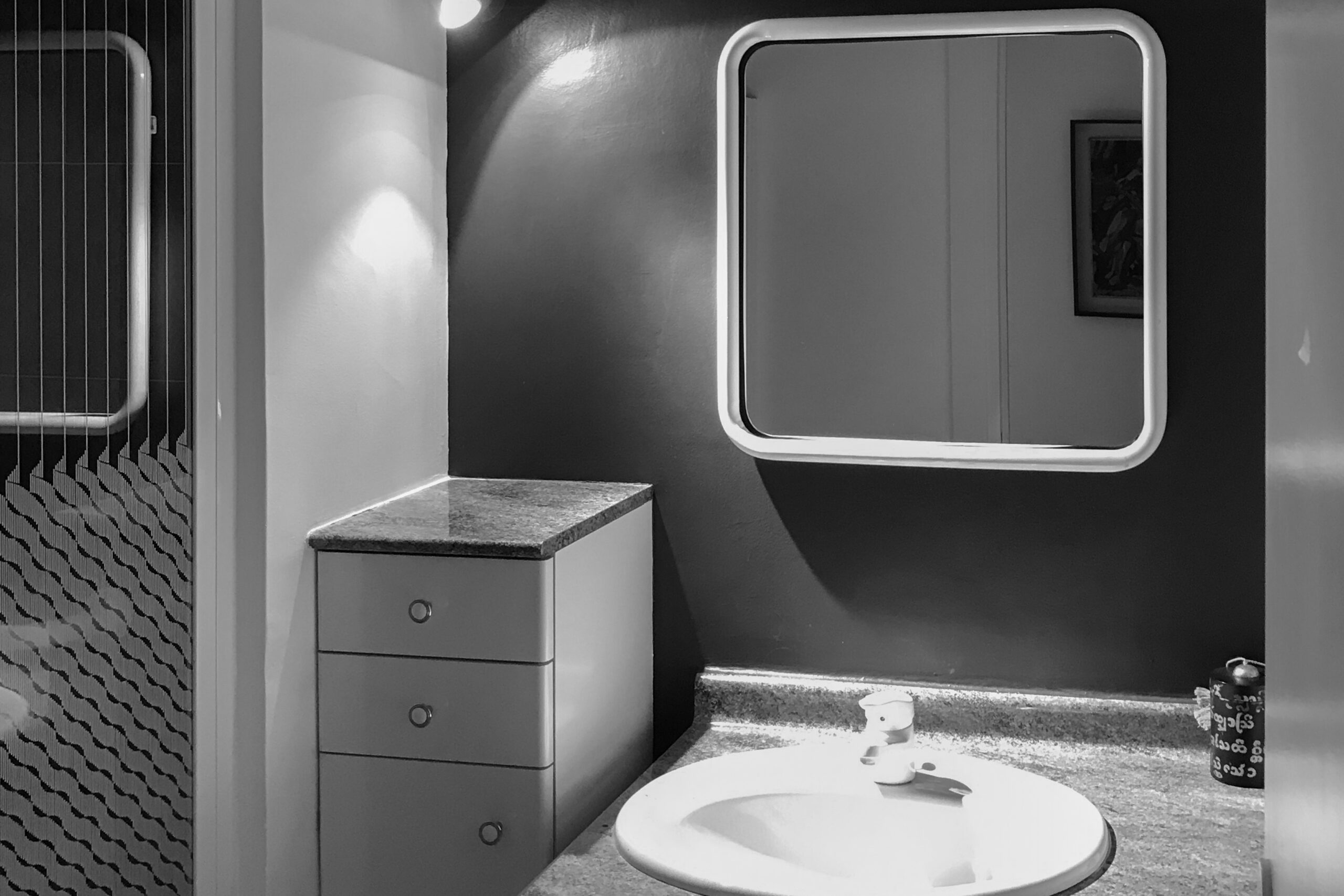
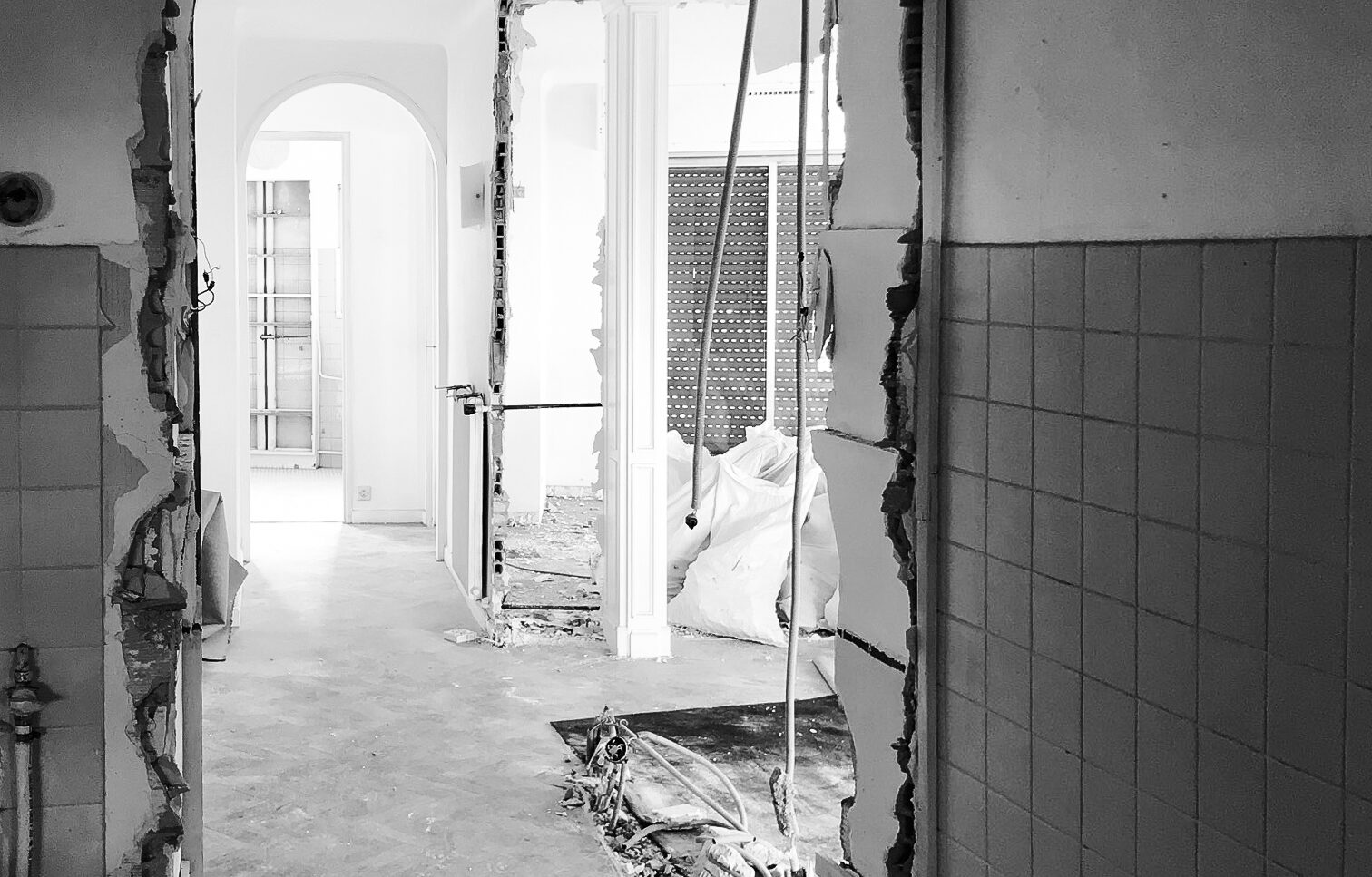
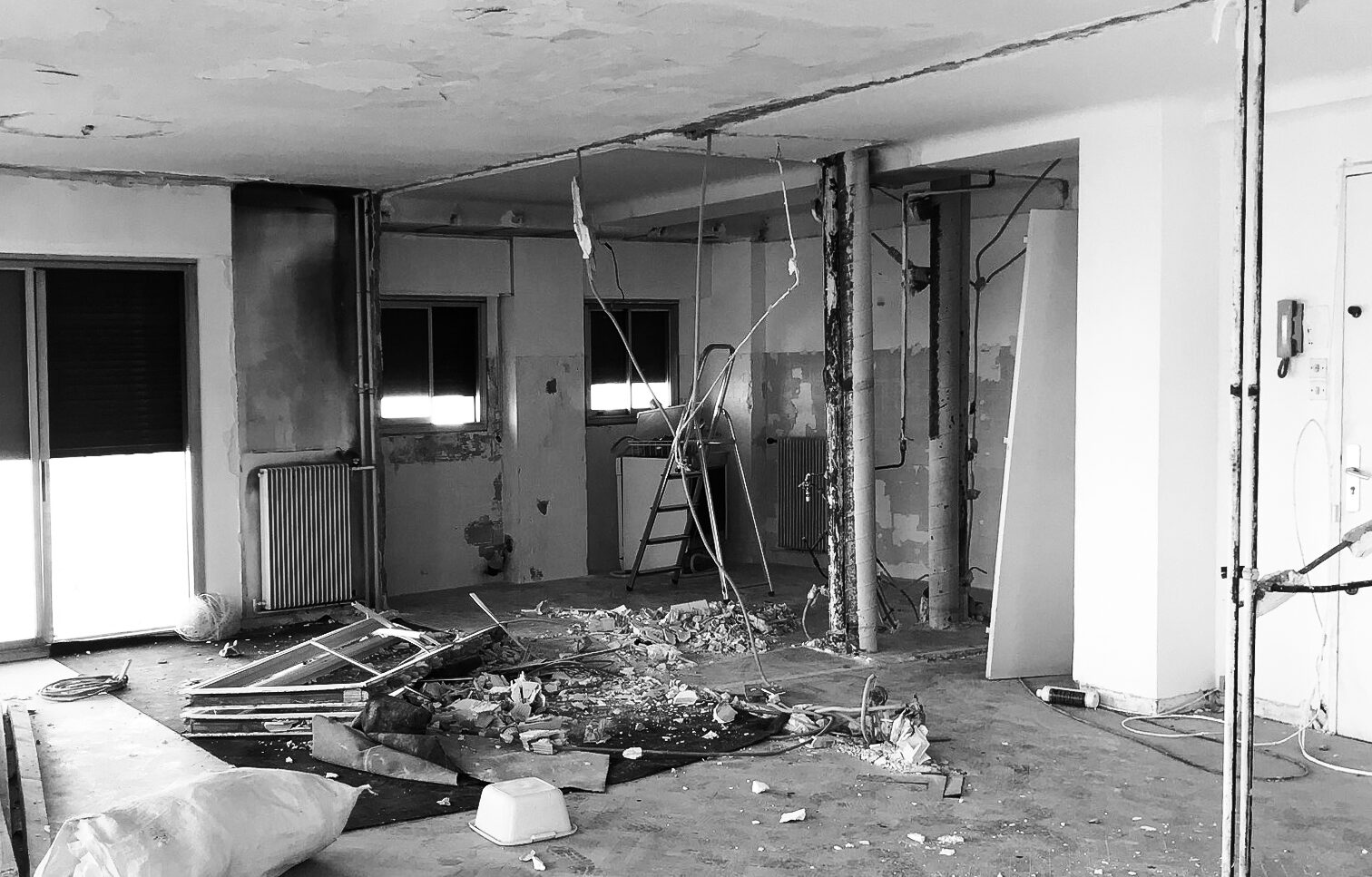
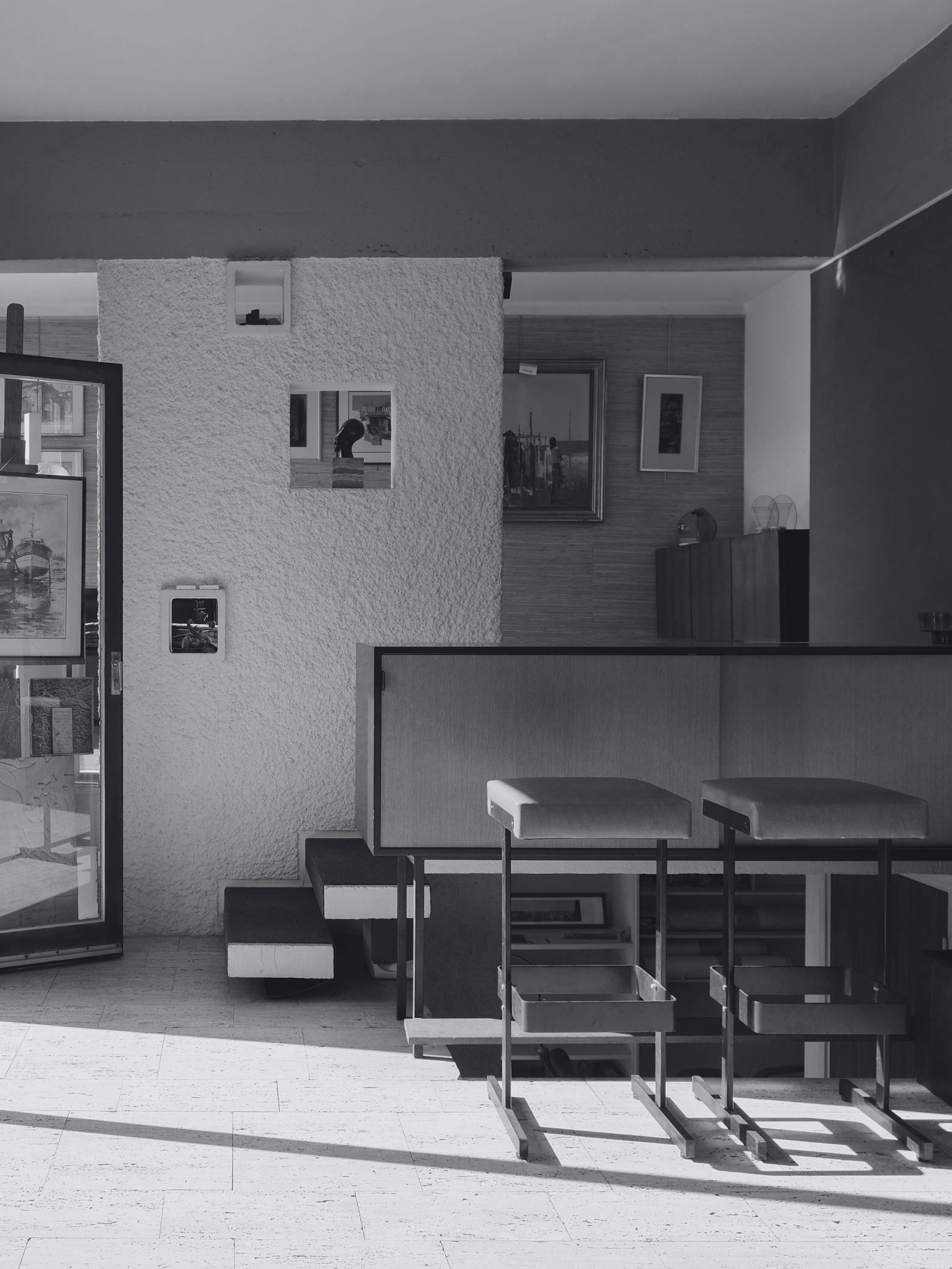
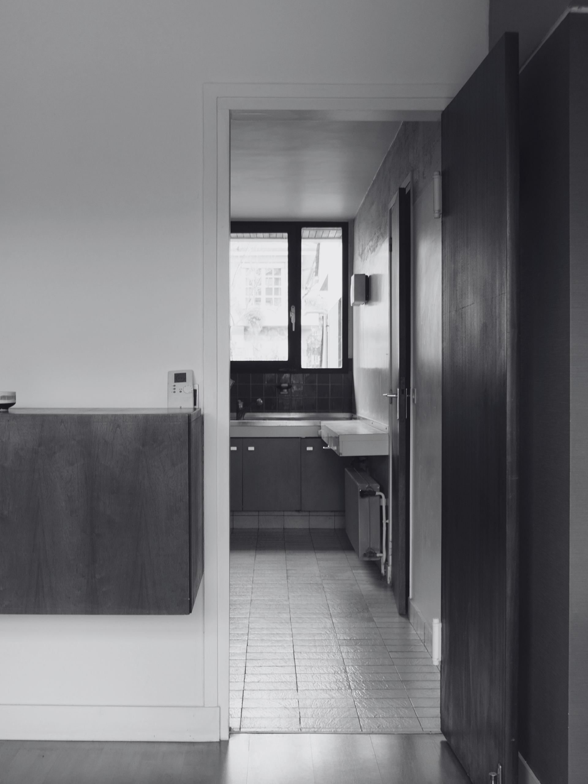
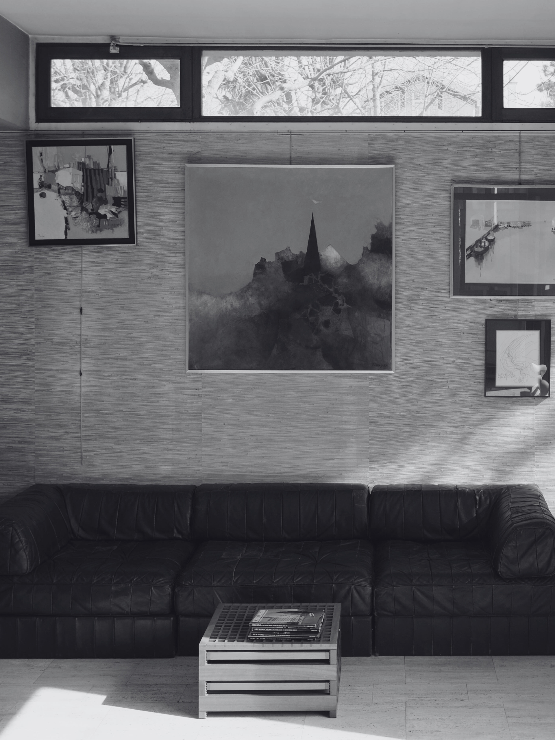
Before …

Objective

Transform spaces by adapting them to contemporary uses, let light shine through, and breathe new life into living areas by opening up the space.

Guidelines

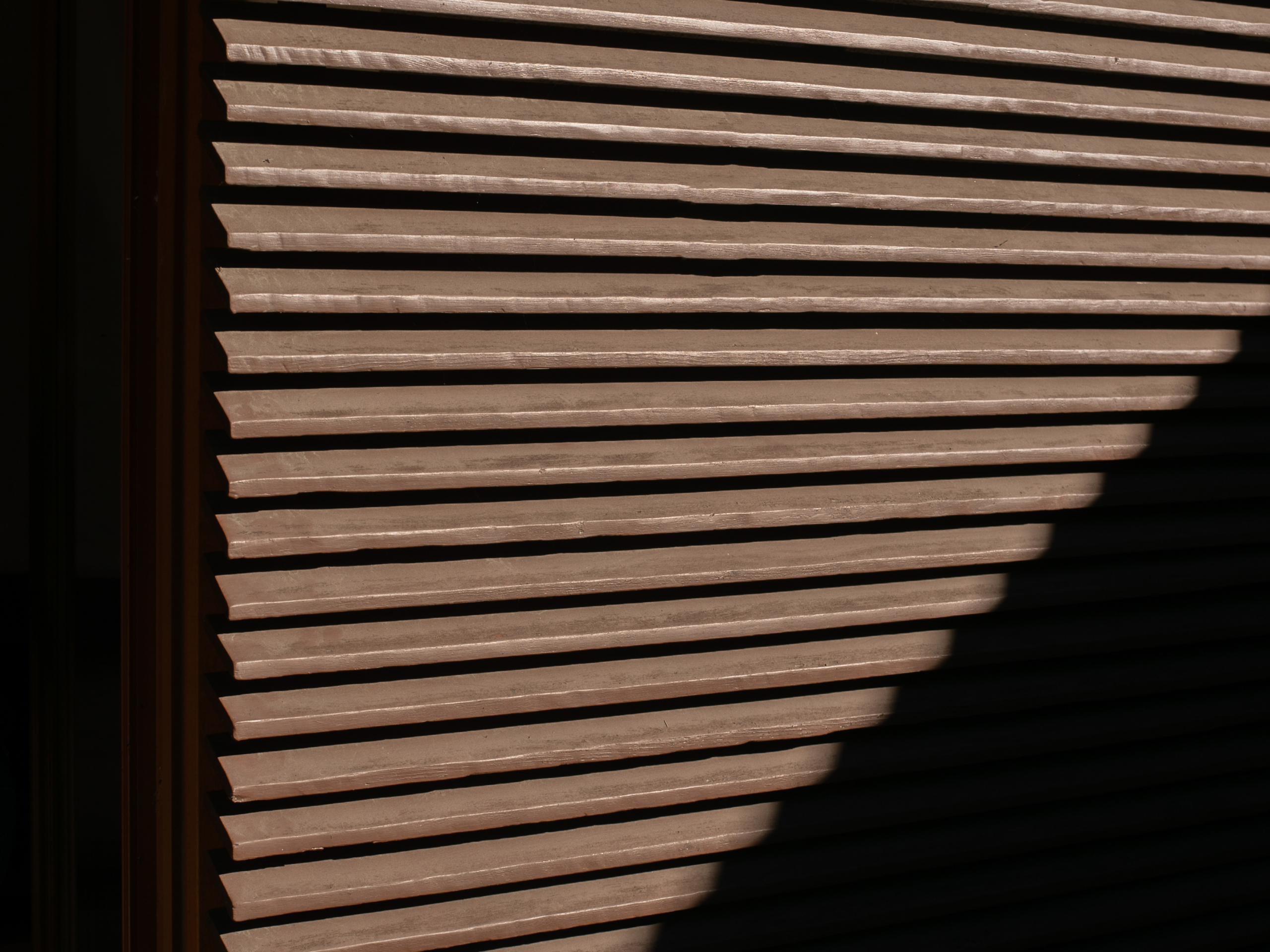
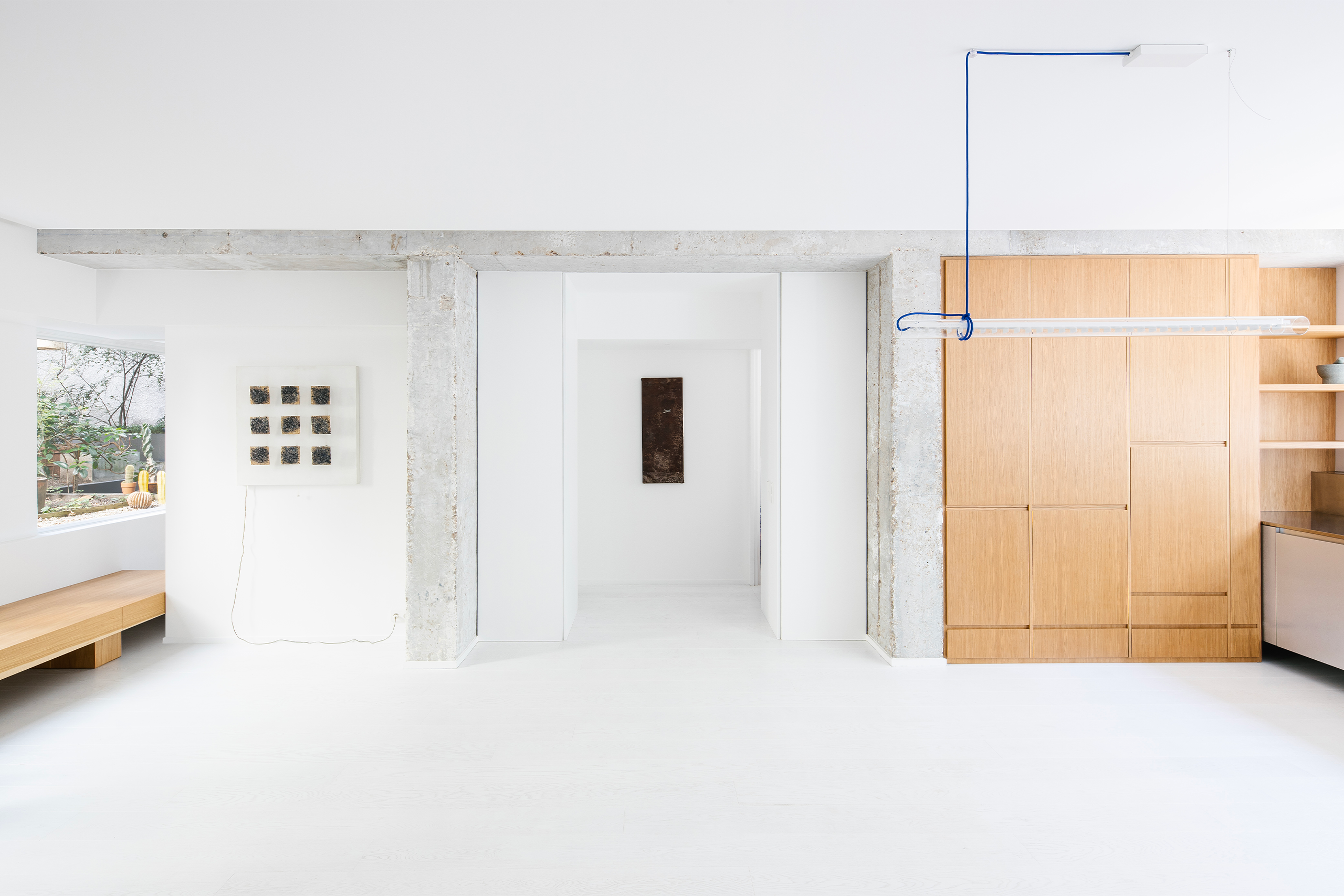
Respecting and enhancing what already existed was the guiding principle behind the project. The modernist lines of the staircase and bay windows, as well as the noble materials, travertine and dark wood, have been preserved and reinterpreted to create a link between past and present.

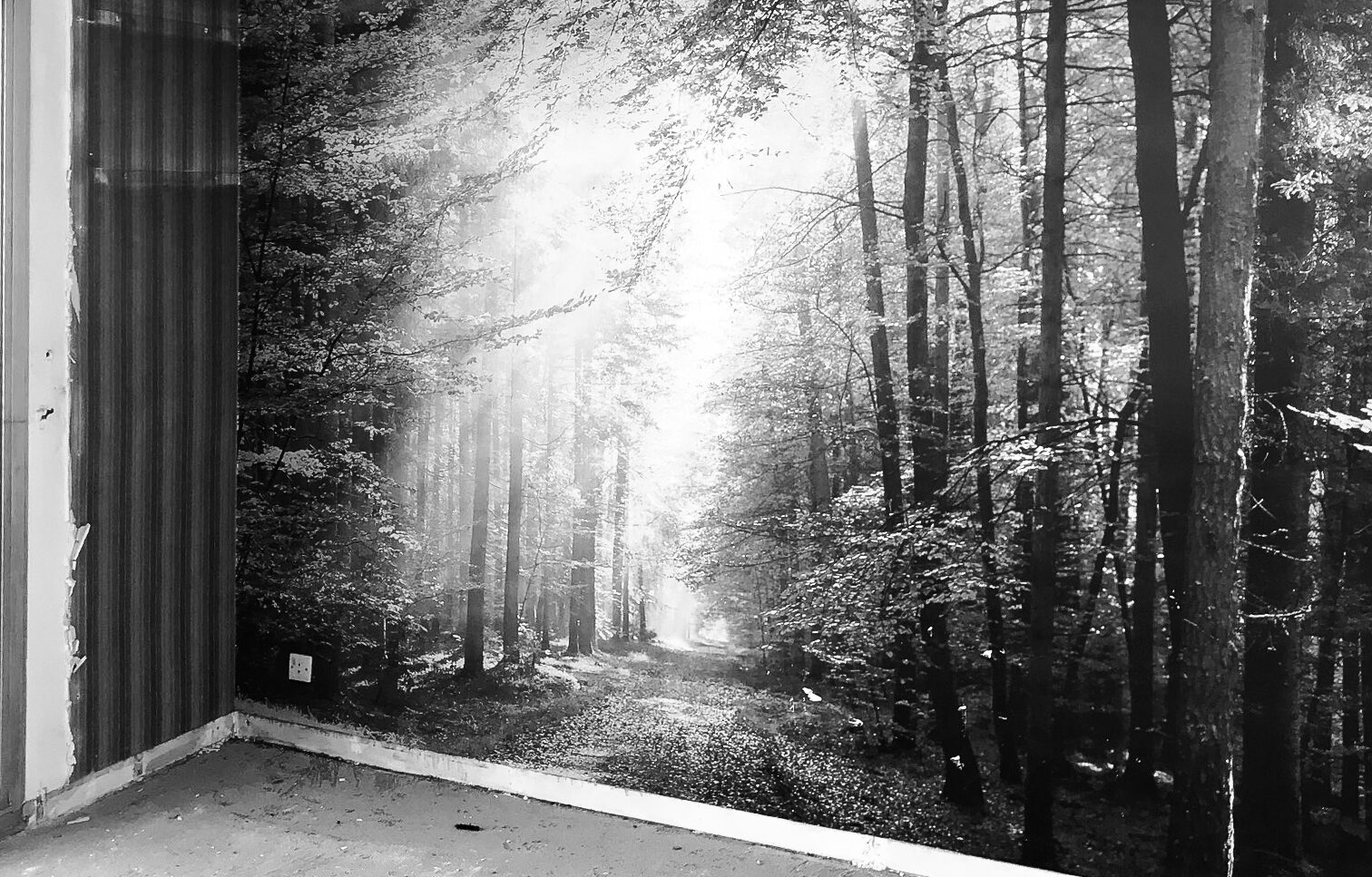
More dated elements, such as the linoleum flooring, plasterwork, and psychedelic wallpaper, have been replaced.

Implementation

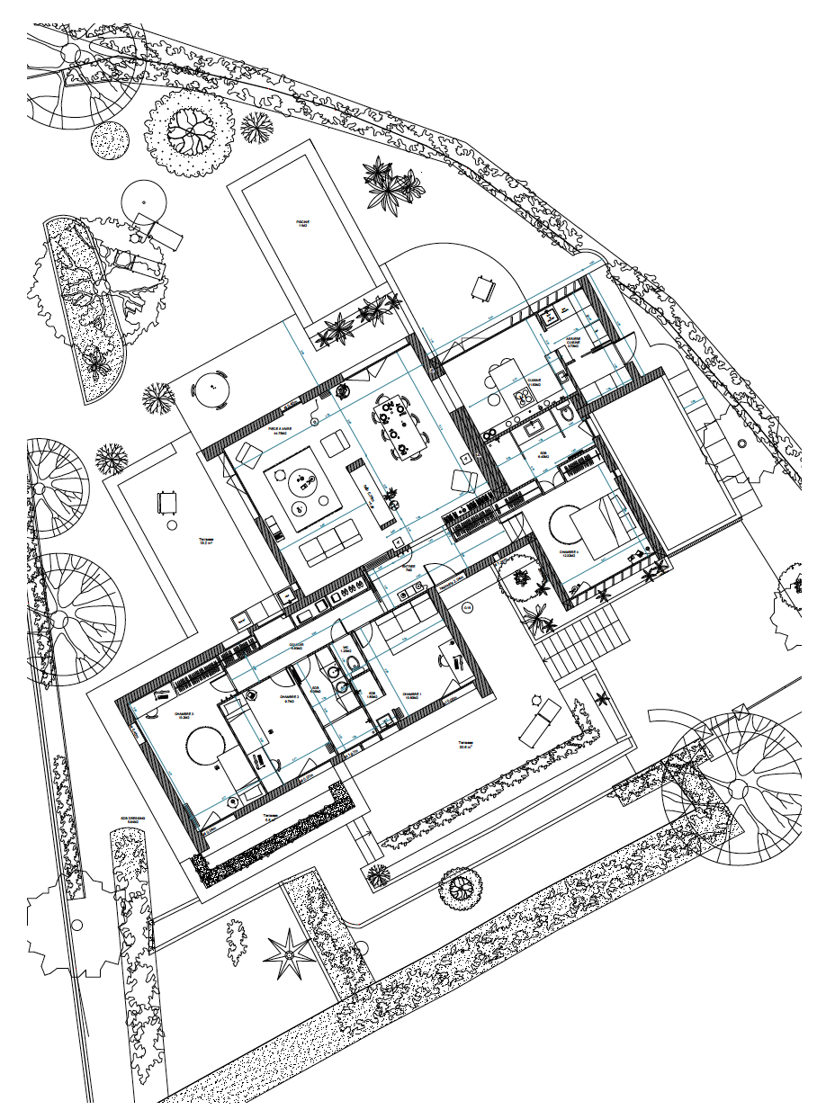
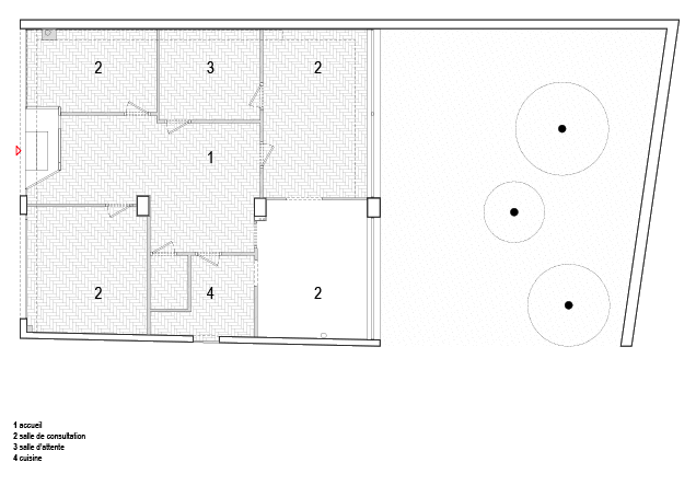
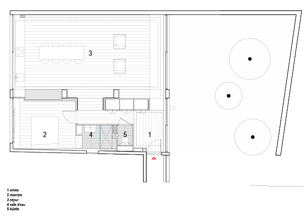
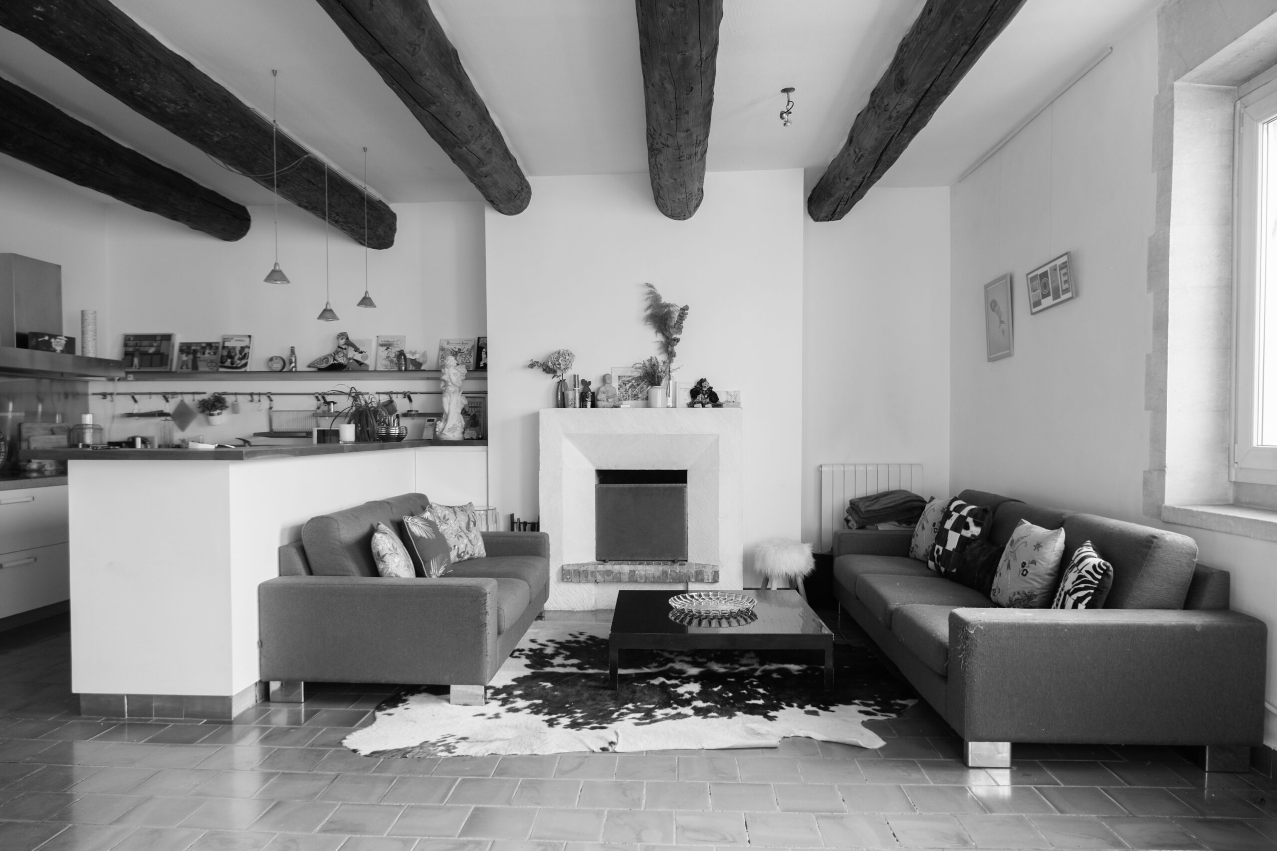
It centered around opening up the ground floor to enlarge the main room and let in more light.

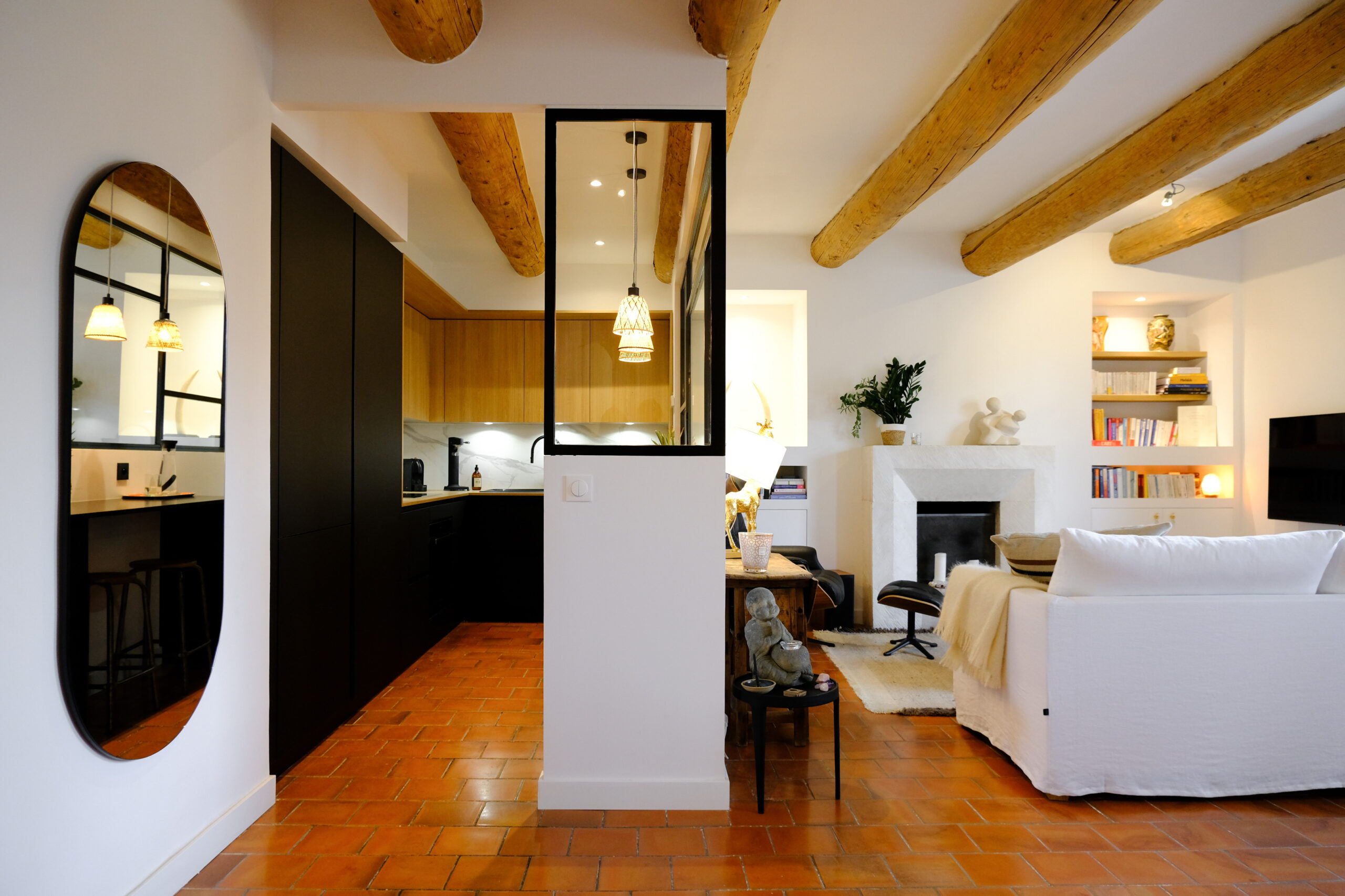
Partitions were removed and replaced with openwork woodwork elements: a bookcase, a screen, and an interior bay window, allowing each space to be identified while maintaining fluidity.

Epicène pursued a warm minimalism by retaining the codes of modernism—clean lines and geometric shapes—enriched with textured materials such as wood, straw, terracotta, lime, and travertine, and colorful touches from the waxed concrete floor to the sky blue kitchen.

Particular attention was paid to the custom-made woodwork, combining different types of wood and material effects in deliberately asymmetrical compositions.

Finally, a complete overhaul of the layout has made it possible to meet the needs of a modern family: creation of a 25 m² master suite, enlargement of the children’s bedrooms, conversion of the former office into a games and TV room, and conversion of the attic space into storage, an office, and a sewing workshop.

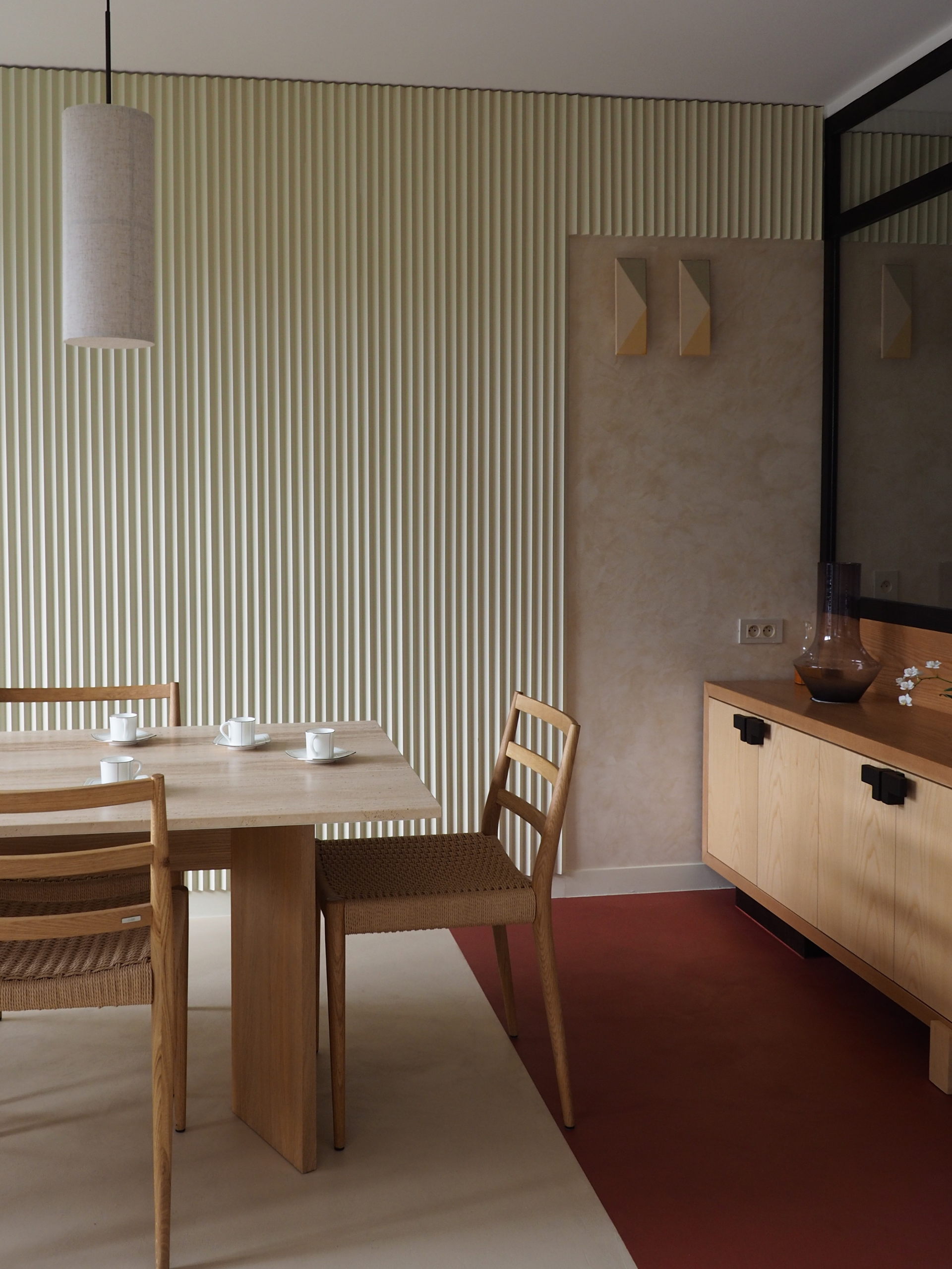
A redesigned setting, bright and full of substance!

LE QUARTIER

Asnières-sur-Seine

Bordering the left bank side of the river, the town of Asnières-sur-Seine is located in the northwest suburbs of the capital, thus benefiting from a strategic location.
  • Crédits photosÉpicène
  • SHARE

Remarkable architecture from the 1960s, this Californian villa is at the heart of a modernist project that has been awarded the “Patrimoine du XXème” label, on its 800 m2 plot in a wooded park at the gateway to the Calanques. A project with character designed by the Marion Bernard architectural firm.

Before …

Target

Preserve the soul of this single-storey Californian villa, while renovating and enlarging it to adapt it to contemporary uses. Enhance its emblematic architecture and strengthen its link with the surrounding countryside.

Course of action

The renovation was carried out with a view to preserving the original architectural features, while adding modernity and comfort. The Fontvieille stone and hollow brick facade, sliding wooden shutters and low stone walls were carefully restored. Inside, the horizontal fireplace in brick and Cassis stone and the large terrazzo floor have been restored to their former glory.

Achievement

On the south side, the sleeping quarters are distributed on either side of the entrance hall by a corridor punctuated by typical 60s storage units.

To the north-west, the living areas are arranged in a row along the terraces, one of which is extended by a swimming pool in the shade of tall umbrella pines. Each extension of the house has been designed as a continuity towards the outside, with terraces allowing you to take full advantage of the surrounding nature. The living room, dining room and kitchen all open out onto the landscape, allowing for total immersion in the natural environment.


Partner brands :

Micro terrazzo and terrazzo: Var Ponçage
Tiles: Carré Créatif
Sanitary equipment: Richardson / Trone
Brazilian quartzite worktops: Granit & Marbre Gambini
Woodwork: Rabot
Furniture and artwork: Axel Chay / Relax Factory / Pièce a part / Francois Bazin / Architectureceramique / Archik
Paint: Ressource Peintures
Bed linen: La Serviette Paris
Handles: Frederic Pellenq
Travertine: Talka

Original plans & project

Modernist architecture immersed in nature, close to sea and hills

  • Crédits photosJulie Fleutot
  • SHARE

Transforming a commercial space, using light, space and raw materials in a way that respects the existing building.

Before …

Target

Convert a commercial space on the first floor of a 1980s building into living space, while revealing the qualities of the existing building.

Course of action

The building’s orientation (East-West), its relationship to the exterior (garden and street) and its structure (reinforced concrete) were the three characteristics that guided the design process.

The plan expresses this orientation, allowing the building to “follow the sun” throughout the day, and thus to have a living space that changes atmosphere according to the light. The existing reinforced concrete structure organizes the apartment and creates sequences. It is also the starting point for the materiality. The brutality of concrete contrasts with the warmth of oak and the preciousness of stainless steel. The painted oak floor is deliberately neutral and light, like a backdrop for the furniture. Framing is used to reveal, give depth, set the scene or escape. They create transversal relationships between the reception and service areas.

Achievement

To make the transition from commercial to residential use, the street entrance was modified to create a new relationship with the street, and to distance the building from it by opening onto the garden.

A new street façade was created, and the first floor was turned into a living space by “inhabiting” the windows: in the kitchen in the living area and the dressing room in the bedroom.

On the garden side, a generous bench was created to encourage contemplation.

The building presented a number of technical constraints, notably the presence of water and air drainage systems. Meticulous work had to be carried out on site on the false ceilings to keep the volumes uncluttered and make them a strength of the project.

Original plans & project

An ambience combining raw elegance and luminous warmth.

  • Crédits photosPhilippe Billard
  • SHARE

Projet moderniste labellisé Patrimoine du XXe, le Parc du Roy d’Espagne est une vaste opération d’urbanisation du Sud de Marseille partant à l’assaut des contreforts boisés du massif de Marseilleveyre qui sépare le centre-ville des Calanques. Le site naturel aura contribué à orienter le projet des architectes vers le modèle des cités-jardins.


Envisagée dès 1959, la construction sera achevée en 1974. L’ensemble comporte un dégradé de 10 tours portant des noms de régions espagnoles, ainsi que 60 villas individuelles noyées dans la végétation de la forêt, dans un cadre offrant confort, intimité, et détente. L’implantation, attentive à l’exposition solaire et respectueuse du paysage, dessine un plan de masse aéré et discontinu.


S’intégrant dans une vaste pinède, le programme crée une ville haute dans les collines. L’ensemble, qui possède ses propres équipements, allie services publics et privés, activités tertiaires et logements. Ainsi, commerces, écoles, club de loisirs, équipements sportifs en plein air, et accès direct au départ des sentiers des Calanques sont à disposition des habitants.

Guillaume Gillet & Louis Olmeta

Né en 1912 et mort en 1987, Guillaume Gillet est un architecte français, Premier Grand Prix de Rome. Connu pour son architecture moderne, il est à la tête de l’une des principales agences françaises. Il participe à de nombreux concours, réalise d’importants aménagements urbains et programmes immobiliers. Parmi ses œuvres les plus célèbres, on compte l’église Notre-Dame de Royan, le pavillon de la France à l’Exposition universelle de Bruxelles de 1958, l’École nationale de la magistrature à Bordeaux, ou encore la tour le Grand Pavois à Marseille. Une collaboration étroite avec de grands ingénieurs l’amène à travailler sur des structures innovantes, mariant habilement l’art et la technique.


Né en 1906, Louis Olmeta est un architecte marseillais. Ses réalisations se concentrent dans les années 1950 et 1960, au moment où la population augmente fortement dans la cité phocéenne. C’est avec l’arrivée de Gaston Defferre que vont se développer ses projets. En effet, le maire de Marseille lance un programme associant de gros travaux d’aménagement urbain et la construction de grands ensembles immobiliers. Louis Olmeta participe également à de nombreuses réalisations privées, souvent en association avec d’autres architectes. Louis Olmeta associe dans ses réalisations les critères du confort moderne et de l’esthétique traditionnelle par le choix des matériaux de façade et de leur dessin.

A contemporary renovation that respects the special soul of this beautiful 110 m2 flat in the heart of the Old Port of Marseille.

Target

To give this typical Old Port flat a new lease of life by revitalising and brightening it up.

Course of action

The idea was to rebalance the volumes of the place and to redefine the living rooms. The idea was also to create a work space that could become a spare bedroom, while keeping the beautiful light provided by the four windows.

The renovation and decoration of the flat was designed in several stages, in order to trace the eclectic career of its occupants, mixing contemporary pieces and travel objects.

Achievement

Changing the volumes of the kitchen was the first thing to be done in order to remodel the living room, to integrate a lounge and a dining area. Unifying the ceiling by sanding the beams (former galley masts) allowed them to regain their original clarity and softness. The challenge was to maintain the feeling of space without losing the clarity, thanks to the glass roof and steel joinery, separating the office from the living room. All of this was achieved by maintaining a colour palette that harmonised with the clay tiles on the floor, by creating a dialogue between the furniture and by creating beautiful perspectives thanks to an XXL mirror with generous curves.

In the night space, a parental suite has been designed, full of softness and fantasy. The bathroom of the suite was entirely made to measure, with gold marble tiles highlighted by a delicately powdered pink that is accentuated by the copper tapware. The choice of a thick, light-coloured carpet brings to the whole the luxury touch of the grand hotels and an unparalleled voluptuousness.

A warm and delicate glow, revealed by the beautiful light of the South.

  • SHARE

Before …

Renovation of a typical apartment of the 60s. Bright, located on a whole floor at the corner of 2 streets, it originally had 3 bedrooms, a shower room, a bathroom and a kitchen. Bought by a couple, one bedroom was removed to create instead a beautiful living space.

Target

To give character to an apartment that didn’t have much. Favouring a large living space, very luminous, where the various pieces of furniture of the owners, keen on design of the 50s and 60s, will be highlighted. Renovate the whole, in its juice, with short perspectives, and with dark and not very functional rooms of water.

Course of action

Destructure to restructure. Open up the spaces as much as possible, but restructure them by using cross-cutting woodwork, giving onto both the hallway and the living room for example, or onto the hallway and the kitchen. Re-open and lengthen the perspectives, bet on white (the majority of the woodwork) and on pretty materials with soft, subtle tones: light terrazzo for the kitchen, slightly marbled tiles for the shower room, matt white tiles, almost chalky for the large bathroom…

Achievement

Except for the 2 bedrooms and bathrooms, all the partitions have been removed. For the most part, they were replaced by custom-made woodwork. For example, the wall of the corridor was replaced by a large bookcase, located in exactly the same place, but which lets the light pass. A lot of work was done on the parquet floor, which was entirely renovated and completely redone in some rooms where there was none left. The kitchen was enlarged to the maximum, with the same principle of “crossing” furniture giving on the corridor. The two bedrooms were optimized by creating custom dressings at the head of the bed. A very graphic joinery work marks the entrance, and gives a strong personality, in contrast to the rest of the essentially white joinery.

A renovation that gives pride of place to materials and light.

LE QUARTIER

Périer – Delibes

An extension of the very chic Carré d'Or, Périer is one of the most sought-after neighborhoods...
  • SHARE

Before …

Without fundamentally modifying the volumes of the apartment, the work consisted above all in a refreshment in all points of view (kitchen, painting, parquet floor, joineries), in order to offer to the purchasers an apartment which resembles them: an apartment with character, at the same time eclectic and audacious.

Target

To modernize an apartment in the Cité Radieuse while preserving its soul, drawing on the work of Le Corbusier.

Course of action

To provide a setting for the numerous works of art and designer furniture of the owners, great art lovers.

Achievement

The layout has been completely redesigned to highlight and stage the couple’s works. The kitchen has been completely redesigned to be more suitable in terms of functionality, while at the same time redoing some of Le Corbusier’s and Charlotte Perriand’s characteristic kitchen elements (high cupboards, reminder of the wooden handles on the kitchen fronts, etc.).
The range of colors used in the apartment is also directly inspired by the range of paint that Le Corbusier used in Bordeaux for the Cité Frugès, whether for the kitchen, or for certain volumes that have been repainted in pink, ivory white, almond green and red.

A precise renovation offering the best possible showcase for pieces and works of art!

LE QUARTIER

Sainte-Anne

Sainte-Anne is a typical residential area of the "city of 111 villages".
  • Crédits photosOlivier Amsellem
  • SHARE

L’ avant …