ALOUETTES
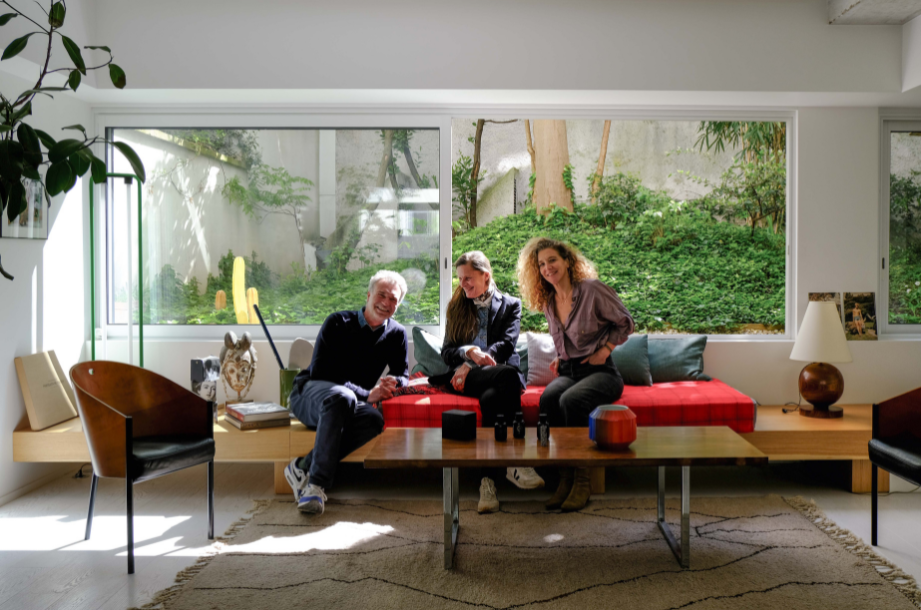
Boris & François, owners of a duplex in a characteristic 80s building in the heart of the Buttes Chaumont district and ARCHIK customers from the outset, had the opportunity to acquire the first floor, a former doctor’s surgery overlooking the street. An ideal project to extend their cocoon, transforming it into a triplex. But it was during renovation that the idea of transforming this space into a multi-purpose space that could accommodate their activities, meet and entertain friends : Le Studio.
And it was with architect Louis Eisenlohr that the alchemy worked : chosen by ARCHIK for his sensitivity and attraction to raw materials and spaces, he was immediately able to immerse himself in the site and the multifaceted project.
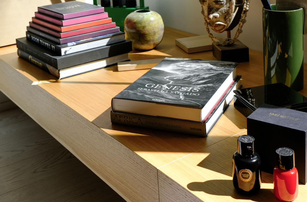
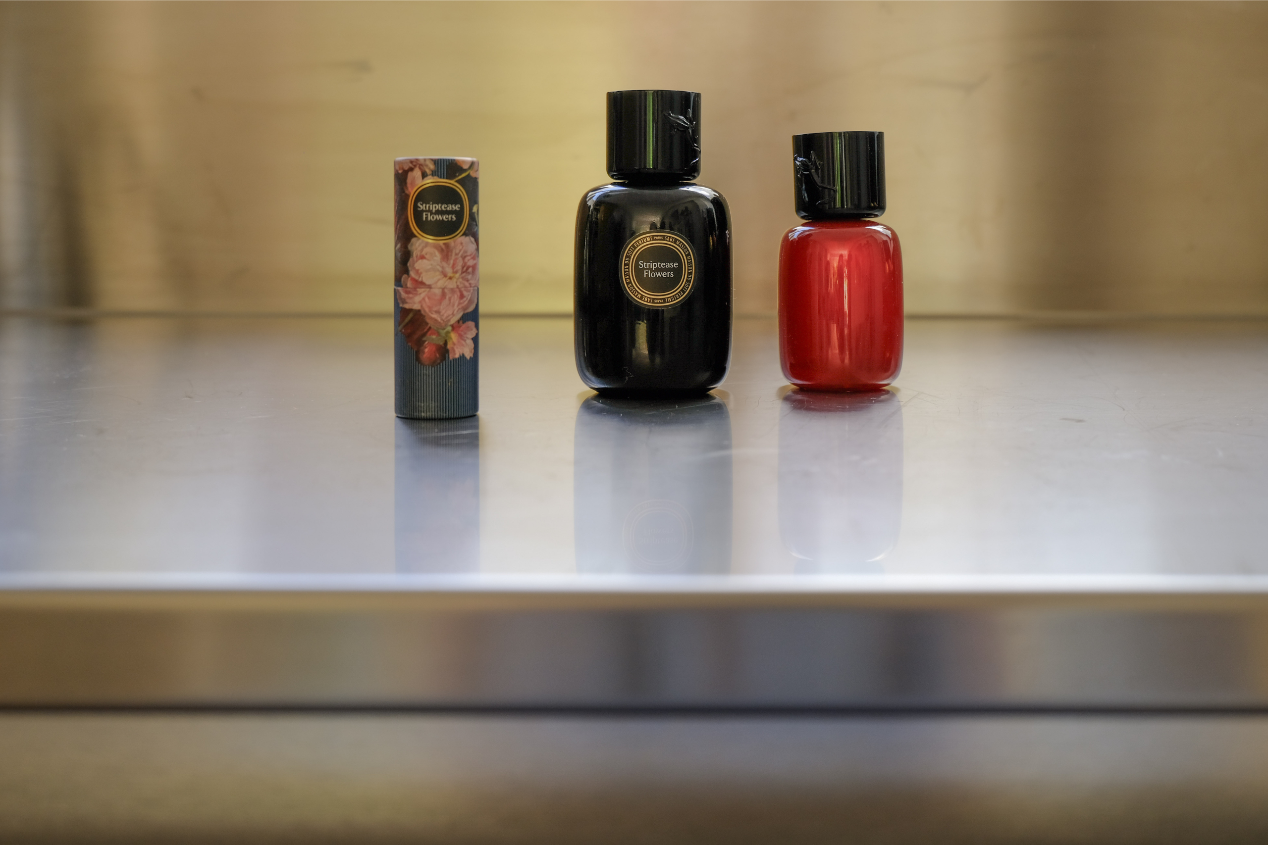
At the turning point of his career, Boris joins forces with Isabelle Masson and Hélène Ortola to revive the fine Sabé Masson perfume brand, with its alcohol-free, solid-care stick perfume.
At the same time, the metamorphosis of the studio began: strong lines and raw materials were elegantly combined with a collection of finely chosen art pieces and furniture. For Sabé Masson, it was an obvious choice : the brand would take root in this setting, a multi-faceted, lived-in address, a meeting place where creativity and freedom coexist, a real olfactory architecture.
Here we are at Alouettes to discover a new ARCHIK & Vous story, combining architecture, innovation and emotion.
Tell us about your encounter with ARCHIK, and how it all began ?
B – The meeting began with Amandine, because I knew her before ARCHIK, when she was still in cosmetics, and we worked together on the launch of the Hello Kitty make-up range, among other things. She’s someone who’s always loved architecture, who liked to rethink places, and this project was already in her head at the time, and she realized it when she moved to the South.
I’ve always really pushed her to do it, because it’s a great project and so is what she’s brought to it. More than a real estate agency, she was able to blend architecture, furniture and design, with a certain look and aesthetic. We’ve always kept in touch, and I’ve watched ARCHIK evolve. It’s been a wonderful professional and friendly encounter.
Did you fall in love with this apartment ? What was your first impression when you visited it ?
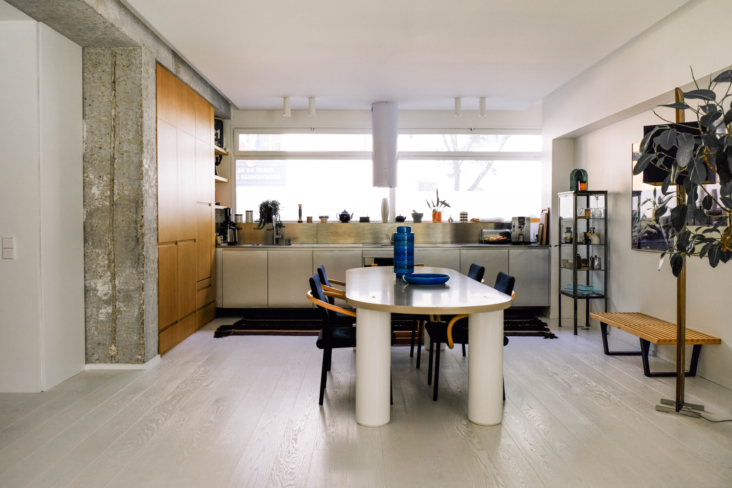
B – It was an opportunity rather than a crush. The apartment was a doctor’s surgery, so it was very compartmentalized, there were small rooms everywhere, and it didn’t have the feel of a walk-through. We quickly saw the potential, as it’s a false first floor, a little higher than the street, so you can see outside but you can’t see inside. And this full-length opening onto the garden could be turned into something incredible.
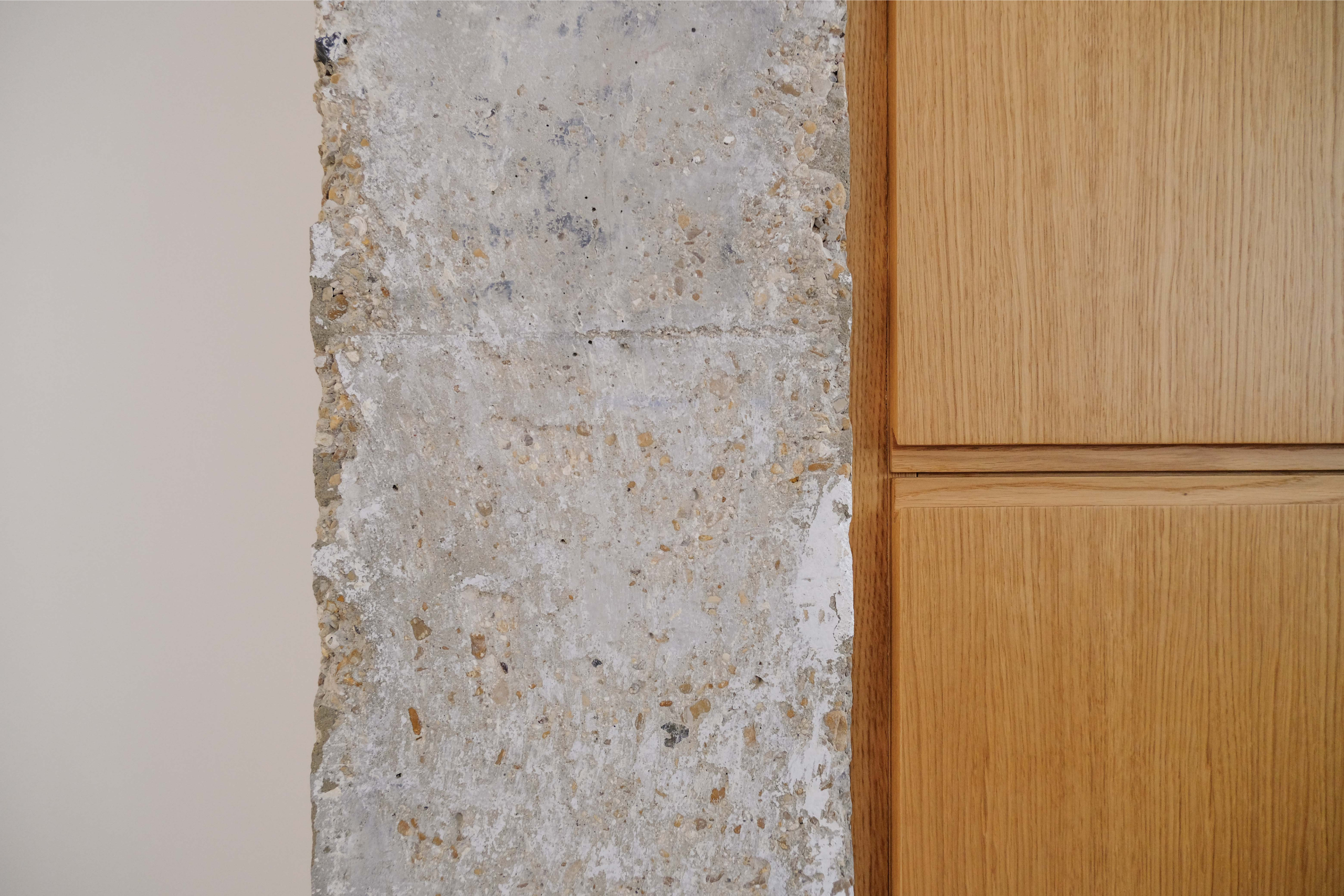
The building dates back to the 80s and is made of Tremblay concrete, which has the advantage of not having many load-bearing walls, so we could open up the entire surface area with this loft-like spirit that we liked.
At first, we thought we’d be able to extend our apartment because our duplex is right above it, but then we quickly realized that the two of us didn’t need any more surface area. So we decided to make two different apartments and turn it into a completely hybrid space.
F – Initially, it was more of an investment. But when one of our tenants left, we saw it as an opportunity to carry out a renovation project from start to finish. We needed change and space. First for friends and family, then during the project for Boris’s new professional project.
ARCHIK chose architect Louis Eisenlohr for your project : how did the collaboration go ? Was it a carte blanche or did you have specific ideas ?
B – I had seen a first architect on my side to design the triplex, who frankly didn’t seduce me. I wasn’t convinced by his proposal, I couldn’t find any links between the two apartments and the different spaces. The project was therefore put on hold for a while, and remained like that for a year, unoccupied. Then I asked Amandine : “As you know me well, do you know an architect we could work with? For me, it was important to find someone who would be a good listener, but who would also defend his ideas, which is exactly what Louis and his partner Olivia are.
We dismantled, we redid, we wanted to play with convention, so we came up with a white package, wooden elements and aluminum.
The idea was to turn it into a multifunctional space that could be used as an office for projects, as an apartment for friends while remaining completely independent, and at weekends as a place for entertaining around large convivial tables. We had to imagine everything.
F – It was a complete transformation of a store into an apartment. We were very careful to keep the volumes consistent. It’s not our main apartment, but we wanted to maintain the same high architectural standards. Louis and Olivia were quick to understand this priority. In fact, I think that’s why ARCHIK recommended them to us. We talked a lot. At first, Boris and I didn’t always see eye to eye, but they were able to reconcile us. They knew how to propose solutions that remained coherent despite everything. For the work, Boris and Louis were the ones who interacted a lot.
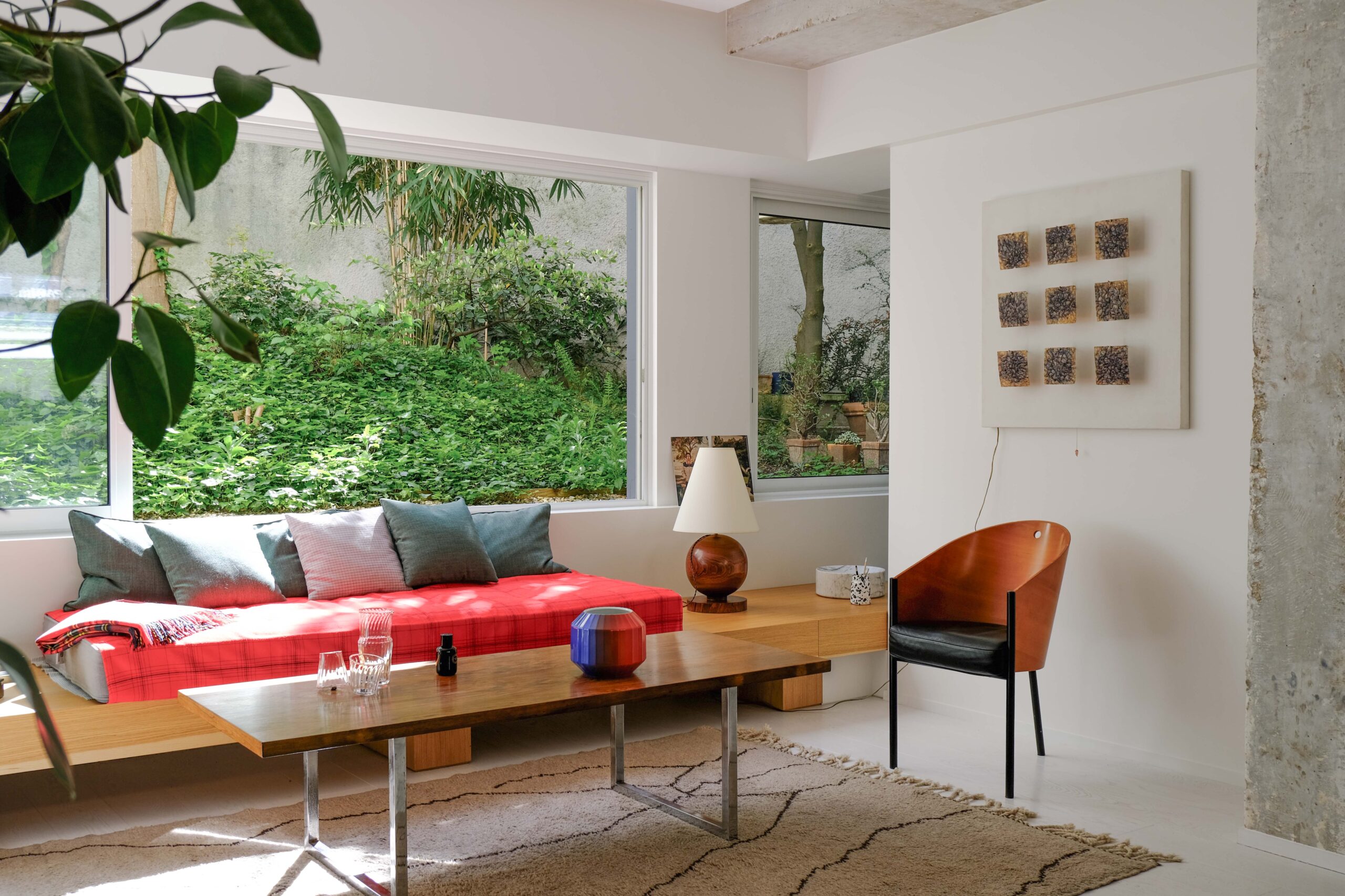
« For me, it was important to find someone who would be a good listener, while also standing up for his ideas, which is exactly what Louis and his partner Olivia are. »
Louis had to convince you or were you immediately won over?
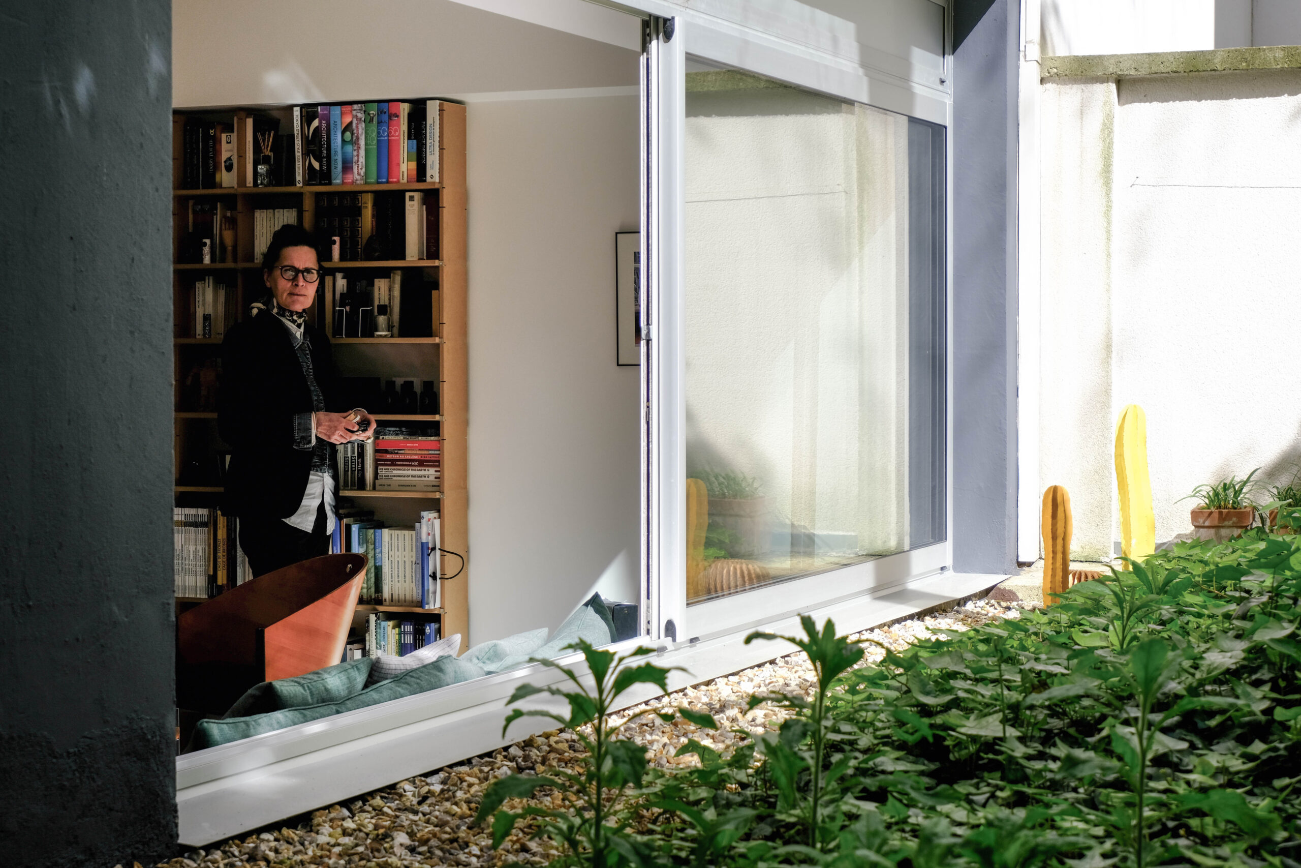
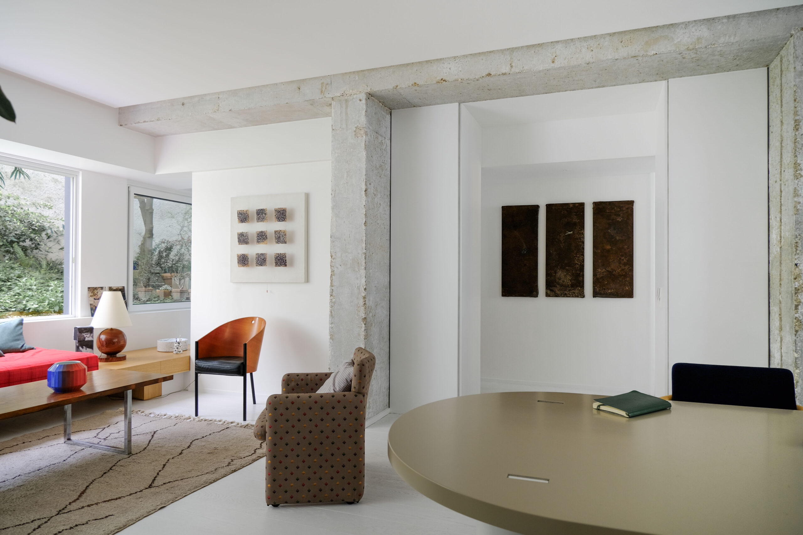
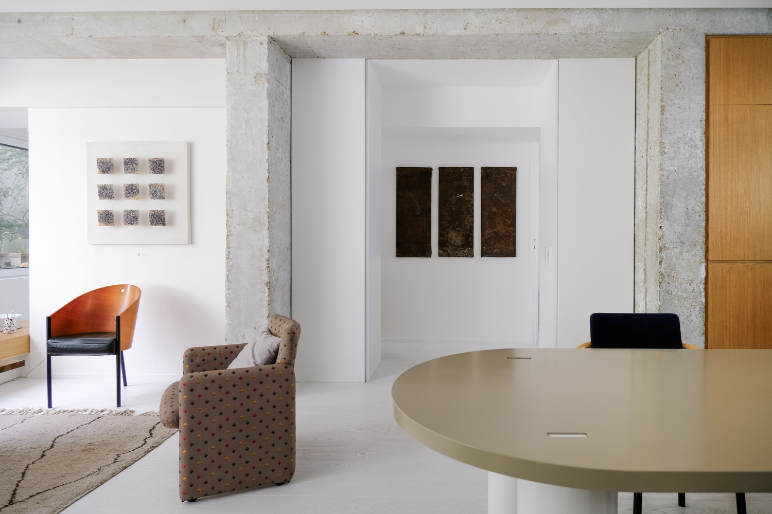
B – Frankly, I think Louis was quickest to convince us of his audacious approach, because that’s what we wanted, and that’s why we hired an architect. We redefined the volumes, and came up with the idea of keeping the structure with these two pillars. We scraped and sanded them completely to restore the rough aspect, which was a big job because we didn’t want to re-varnish them, and there are still places where you can see the pencil lines. It’s true that when you arrive, the fact that everything is glazed from one end to the other creates a superb perceptive effect. He’s very good at working with volumes.
F – They were really the ones who designed the layout of the space. We’d never envisaged it with such coherence and simplicity. There are some biases, but no gimmicks. Everything has a function for everyday use, for light or to emphasize the volumes. We put our trust in them quite quickly, but it wasn’t a case of « carte blanche ». We really wanted a relationship that was both demanding and constructive.
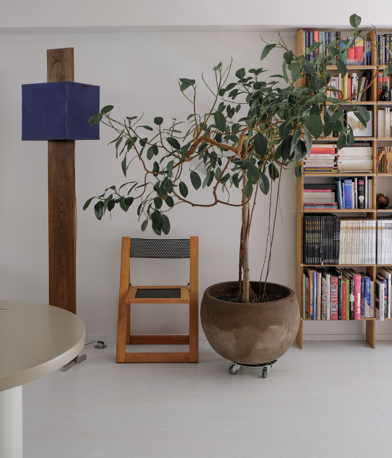
How did you go about decorating your new home, and where did your inspiration come from ?
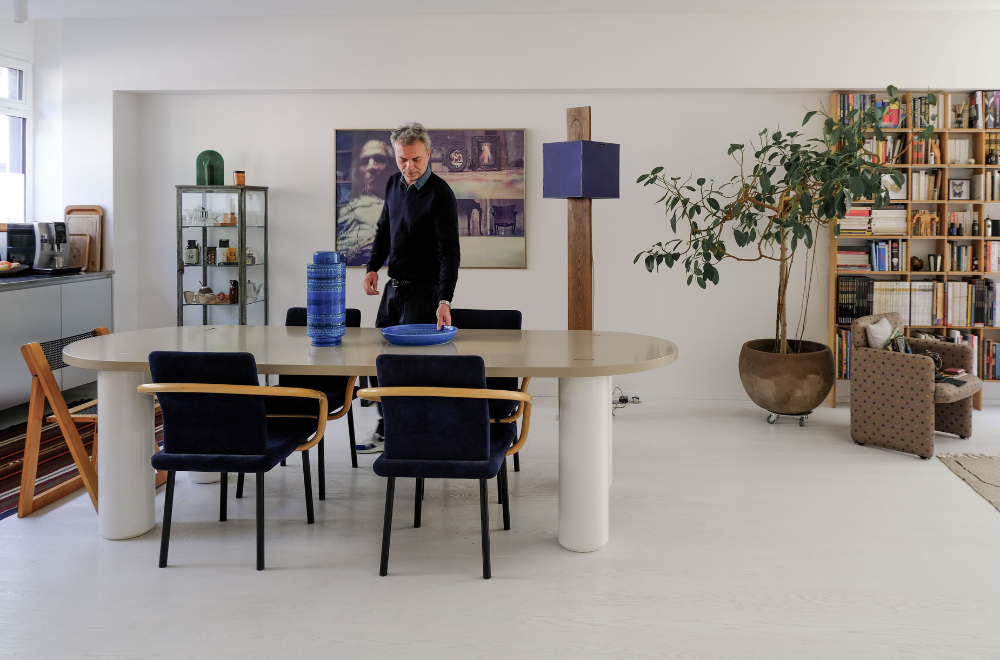
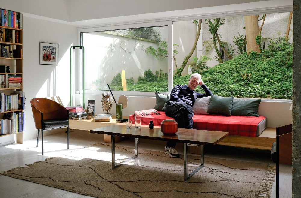
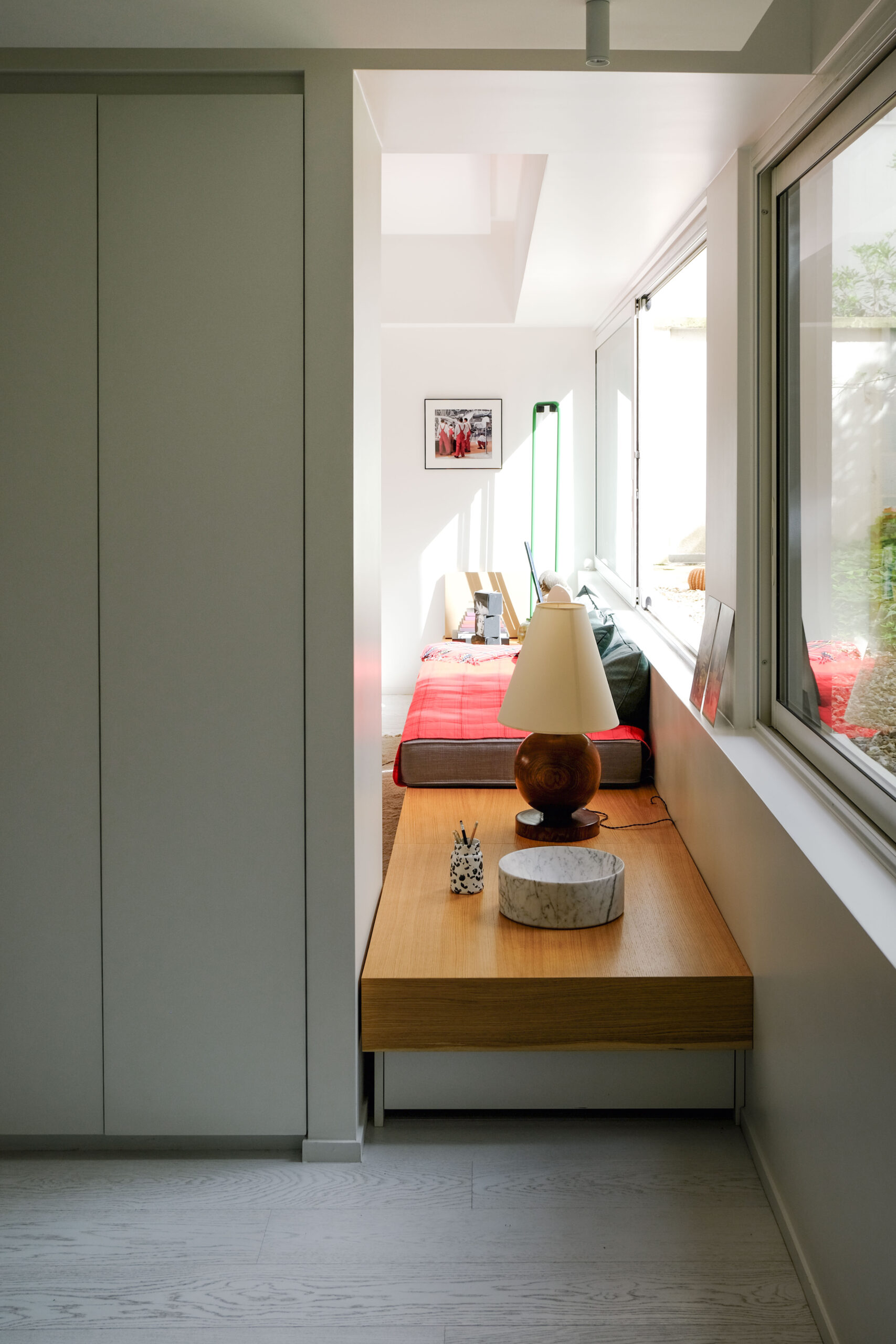
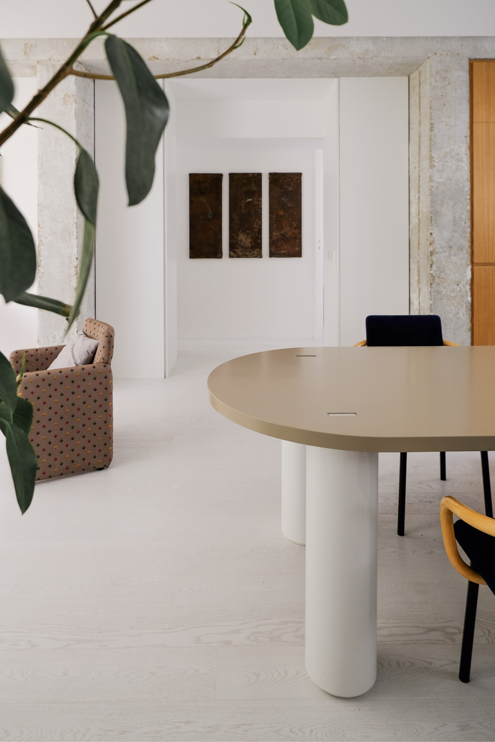
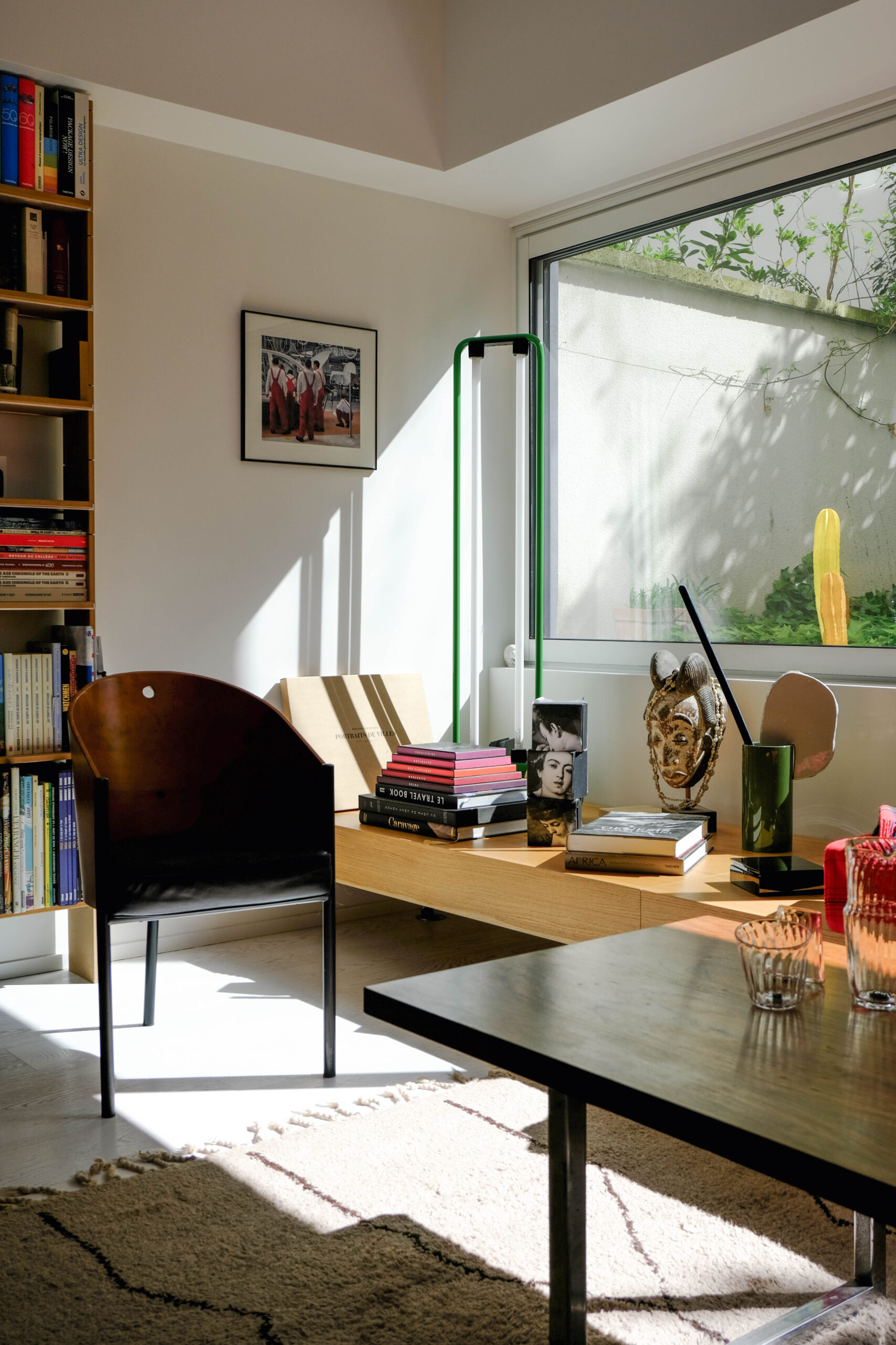
B – Quite honestly, it’s not imagined or planned, it’s made with a lot of objects that have followed us. This table by Putman published by Silvera, for example, this large format is a unique piece that I had in one of my old offices. The same goes for these Sottsass chairs, which we found on the market. Or these Italian chairs in metal and wood that were stored in the cellar. We accumulate a lot of things, which means we can change pieces from one apartment to the next, bringing them down and then putting them back up again. It’s a very lived-in space, with pieces we’ve had for a long time. Apart from the bespoke furniture that was designed to fit into the space, like this large wooden bench under the window, there’s very little furniture that we bought for the place.
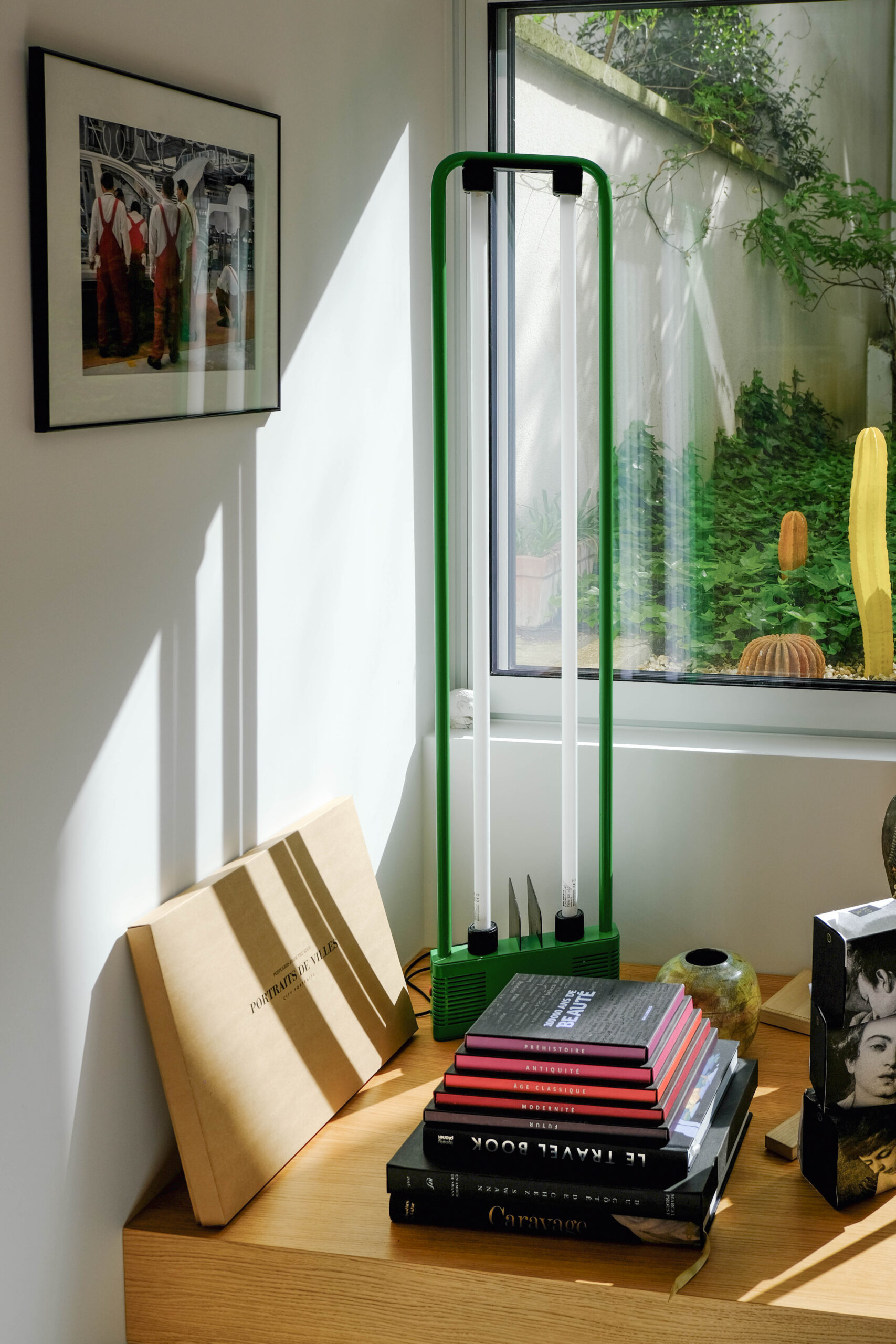
F – Our main inspiration (and this also comes from the building, which dates from the early 80s) remains modernism and a little Memphis. We add a few touches of memories, travel and books. It was Louis and Olivia who, by treating the bench all along the bay window, added a Japanese touch that responds to the garden and, of course, echoes modernism.
Isabelle, Hélène, as occasional visitors, what do you like about this apartment and how do you experience it ?
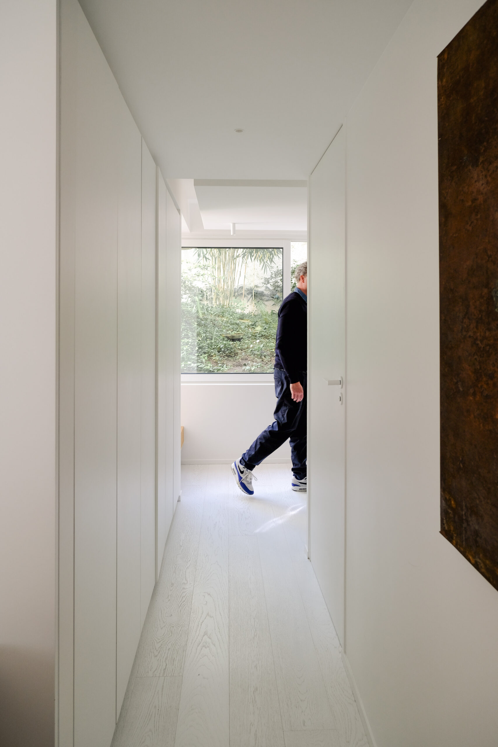
B – It’s a place that breathes; I’d say it’s like a skin, an airlock. Although it’s very straight, with lots of edges, it’s quite molecular. From the moment you step through the door, it’s as if you’re entering a bubble. It’s quite astonishing, with a very protective side. There’s also this tension between the street and the garden that I find really successful. It’s the garden that has taken the lead, you’re called by this place, the light plays a big part in it, and so the street is an accomplice of the garden, but it’s first and foremost the garden that takes the floor. For me, it’s a reassuring, protective place, you feel it’s welcoming in the sense that you can do all sorts of things there, meetings with friends, feelings, but also work, there’s nothing to damage or upset the spirit. That’s great, because it used to be a thankless place, as Hélène and I knew it. Since the renovation, it’s as if the garden were lit up by this apartment.
F – We’ve known several versions of this place, and the configuration was different before the works. I enjoyed seeing its transformation. If only for the light, with the creation of this walk-through side. It’s serene and calm, you’re on the street but you can’t hear what’s going on, and there’s a real sense of calm with this view of the garden. Sabé Masson is all about living things and raw materials. It’s a very obvious place for the brand, linked to nature and green…
Would you have any advice for people embarking on a project like yours ?
B – We sometimes think that we don’t need an architect, but when you start with a place that needs restructuring, I think it’s essential to be accompanied and to have that eye for working with volumes. It wasn’t easy to do something with this place, it could have been quite different, and I think that thanks to Louis‘ work we’ve exploited its full potential.
F – Going through ARCHIK! Honestly, putting us in touch with each other gave the project a new lease of life! Finding the right architect is far from easy or automatic. And a website isn’t enough to judge the quality of an architect, especially when it comes to dealing with companies and clients.
THE 3 FETISHES
THE ROOM IN THE HOUSE
I love this living room, with its large convivial table, its loft feel, its large opening onto the garden and its flowing aspect.
THE OBJET
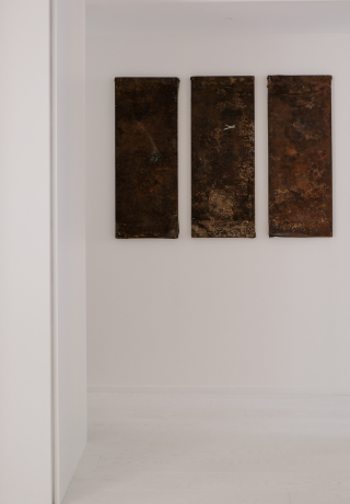
The triptych by Thierry Berbezy, artist and writer, but above all scriptwriter. It’s a work that’s been with me for a very long time and that I like a lot. It’s a unique piece of work, made from rusty old metal boards that he found and drew on.


